Gerhard Richter
Art Vent Letting the Fresh Air In
July 8, 2012

· Gerhard Richter, S. with Child, 1995, Oil on canvas, 41 cm x 36 cm, Catalogue Raisonné: 827-2
I took a mental health hiatus from my blog, but now I’m back. [Also had to delete a previous post, where the foundation that represents the estate of the artist I rhapsodized about complained about the accuracy of the info I copied and pasted from the museum press release—and were also annoyed that I’d included a Wikipedia link they said contained wrong info. Huh? Seems it might be easier to edit Wikipedia than to ask me to remove the link but hey, as it’s my only complaint in 475 posts, I can handle it!].
I took a mental health hiatus from my blog, but now I’m back. [Also had to delete a previous post, where the foundation that represents the estate of the artist I rhapsodized about complained about the accuracy of the info I copied and pasted from the museum press release—and were also annoyed that I’d included a Wikipedia link they said contained wrong info. Huh? Seems it might be easier to edit Wikipedia than to ask me to remove the link but hey, as it’s my only complaint in 475 posts, I can handle it!].
Anyway, there’s nothing more likely to get me going than reading stupid stuff about art and artists—like this article, “Good Art, Bad People” by Charles McGrath in the Times, which cites examples to bolster the stereotypical idea that artists are more deranged than the rest of the population. I think articles like these are written so the authors can assuage their egos with the excuse, “I coulda been a contender if I weren’t so fucking nice.” Because we think about stuff so much (artists are, at their core, analytical, always wondering, “how could this be different?”) it’s possible we may be less likely than others to conform to superficial societal norms, but I refuse to make further generalizations (I remember someone once telling me that I couldn’t be a “real” artist because my studio was “too neat”—although there’d be no problem with that at the moment). I’ve known a lot of artists—yes, even great ones—some of whom were totally agreeable (no one is nicer than Ellsworth Kelly) and others who were utterly horrid. Like the rest of the population.
Can good people make good art? Or to make it a little harder: Can good people make great art? The answer here might seem to be equally self-evident. There are countless artists who seemingly lead decent, morally upstanding lives, who don’t beat their wives, slur the Jews, or even cheat on their taxes. There are many more of these, one wants to say, than of the other sort, the Wagners, Rimbauds, Byrons, et al., who are the exception rather than the rule. And yet the creation of truly great art requires a degree of concentration, commitment, dedication, and preoccupation — of selfishness, in a word — that sets that artist apart and makes him not an outlaw, exactly, but a law unto himself.
Great artists tend to live for their art more than for others. This is why the biographies of so many writers in the 20th century who were otherwise reasonably good people, or not monstrous certainly (think of Fitzgerald, Faulkner, Bellow, Yates, Agee, to take a few almost at random), are strewn with broken marriages and neglected or under-appreciated children.
Yadda, yadda, yadda. McGrath “wants to say” this is the case because an article about kind, generous, thoughtful, sober artists would be totally boring. Also, notice he may be a bit out of touch, as his famous examples are from the last-century or before, when divorce was difficult and alcohol flowed. These days, successful artists are more likely to be super-functional, careerist and businesslike, than dissolute. No one has time to be a drunk.
Meanwhile, if the image presented in the film, “Gerhard Richter Painting” is true, then the world’s most famous living painter is a real sweetie-pie, who has said, “I have painted my family so frequently because they are the ones who touch me the most.”
That’s a quote from the wall text at the recent Beaubourgretrospective, which I saw recently, and this is as good an excuse as any to post a few more. *
On classicism:
The classical is what holds me together.
It is that which gives me form.
It is the order that I do not have to attack.
It is something that tames my chaos or holds it together so that I can continue to exist, that was never a question for me, which is essential for life.
On chance:
Letting a thing come, rather than creating it.
On abstraction:
Horrible, gaudy sketches, sentimental things, functioning through the association of ideas, anachronistic, ambiguous, practically pseudo-psychodramatic and therefore unintelligible, without meaning or logic, if indeed there must be any.
I pursue no objectives, no system, no tendency; I have no programme, no style, no direction. I like the indefinite, the boundless. I like continual uncertainty.
* Note: I’ve taken some editorial liberties with the rather clumsily translated English text, eliminating some excess “that”s and a “really” (hard to imagine Richter saying “really” in any language) and choosing “touch” (in the French translation, it was touchant) over “affect” as in his family being the ones who touched/affected him the most.
Comments (6)
June 22, 2012
I’ve been back from Europe just over a week, but life’s intervening challenges have made it seem like three. Or maybe I was never there. Perhaps I just dreamed it. Regardless, I will share my hazy memories.
Ranting, as I have recently about museum buildings that are more about architectural hubris than art, it was a pleasure to revisit the Beaubourg for the Richter retrospective and see his work installed in an airy, non-linear context that included natural light and breathtaking views of Paris. See? It can be done. Ironically, one of the architects for the museum, which was built in 1977, was Renzo Piano, who's also responsible for the new, architect-centric Modern Wing at the Art Institute of Chicago. But at least, earlier in his career, Piano proved that artwork and architectural statement can happily coexist.
Gerhard Richter at the Centre Pompidou
The ecstatic ride from Damien Hirst to cream tea.
May 14, 2012
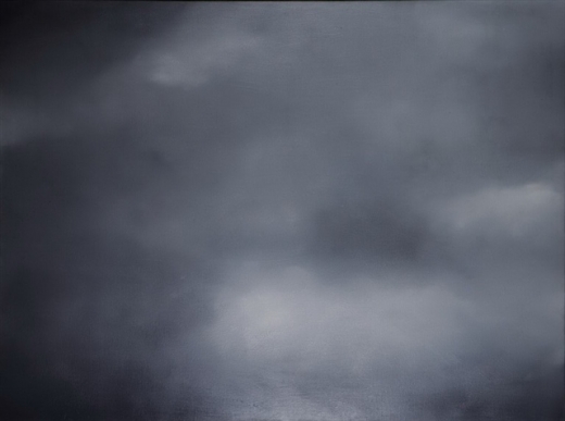
· Gerhard Richter, Clouds (Grey, 1969), oil on canvas, 150 cm x 200 cm.
I was starting to write a post about my trip to Chicago, but got distracted when I emailed to a friend that I was going to Paris soon to see the Gerhard Richter retrospective at the Beaubourg and drawing show at the Louvre, and she sent me this, a rant about the commodification of his work by Reuters' Felix Salmon.
Richter’s paintings being commodities has nothing to do with Richter, the artist. Clearly this was not the artist’s decision, nor his intention. Contrary to what Salmon has to say, a majority of us in the “making” part of the art world think Richter is very important, someone with a tremendous influence (the fact that the film, “Gerhard Richter Painting” is still running, after two months, at Film Forum, is testimony to that). I, for one, am grateful to have a model, someone to look up to, who's still producing great work at 80 or whatever.
But here’s the thing: Picasso, de Kooning, and Warhol aren’t just good artists, they’re important artists — among the most important of the 20th Century. They permanently changed the way we look at and think about art: what it is, what it can do, what it should look like. Richter’s no slouch on that front, but he’s not in their league, and never will be.
So how does a financial writer get to decide which artists are “important” and which aren’t? I don’t see Reuters asking me for financial analysis.
The writer’s assumptions are faulty on several counts. Just because Picasso and Warhol took longer to be recognized in the 20th century doesn't mean that's what's necessary to be an "important" artist in the 21st century, when communication is so much faster, when the cultural world is so much bigger and more savvy, and when (as a result of Picasso, Warhol, and Duchamp) “difficult” is easy, breaking rules (or looking as if you’re breaking rules) is the order of the day, and “meaningful” is much harder to come by. Given his times, which have been characterized by cynicism (think Jeff Koons, Richard Prince, Damien Hirst) and any sincere attempt at beauty has been taboo, Richter is actually radical. In this climate, to be unabashedly conscious of painting's possible emotional content, to paint landscapes, family portraits, candles—anything that, in other hands, would be seen as sentimental—takes a lot of courage; not to speak of working in several different styles when most artists and galleries saw, and still see, developing a single "signature" as the only route to recognition (think BriceMarden).
Further, his dealer is not Gagosian, who might automatically be assumed to be promoting commodification but Richter, since the beginning, has been represented by Marian Goodman, who has always demonstrated enormous restraint, and for whom the art always comes first.
So Richter makes a lot of paintings; let us not forget that it’s his passion, and he can afford to indulge it. The writer’s own examples, Picasso and Warhol, proved that it’s possible to be both prolific and “important.”
It's easy to bash success. But sometimes there's a reason for that success.
So what if collectors are having a feeding frenzy. I think/hope/pray that we're coming into a time when the spirituality in art (and, dare I say, b-b-b-beauty?) will again be celebrated, and Richter is leading the way.
March 12, 2012
Sometimes I think it’s my job to be the contrarian, although that hardly applies where Gerhard Richter is concerned. His work and philosophy have long inspired me, so it was a special pleasure to see Corinna Belz’s film, “Gerhard Richter Painting,” which confirmed everything I always wanted to believe about the artist. Belz has great understanding, both visual and intellectual, and strikes just the right note, which films about art hardly ever do. I won’t say more, because I’m most likely reviewing the film elsewhere, except to urge you to see it (even twice, as I did) at Film Forum, where it opens on Wednesday and runs through the 27th.
 Eleanor Antin, The King, 1972 (image from the Web)
 Eleanor Antin, The Angel of Mercy (Florence Nightingale), Myself-1854, 1977 (Image from the Web)
Also I learned, from watching Richter doing interviews in the film, how to answer impossible questions. Which of his painting styles does he prefer? “It varies,” he says. What is his response to fame? “It varies.” So helpful! Now when people ask me how much time I spend in the country or the city, I can say, “It varies.” Which do I enjoy most, painting or writing? “It varies.”
So now for the curmudgeon part—are you sitting down? Prepared for a terrible shock? Okay, here goes…I am not a fan of Cindy Sherman. This is almost as huge as admitting I liked some of Damien Hirst’s spots, but I have always thought of Sherman’s work not as feminist, but anti-female, even mocking—clichés of women as established by the male world. Unlike the women I care about, her permutations are not warm, nurturing, sympathetic, or even sexual. Would you choose any of them to be your best friend? I didn’t think so.
I may also be prejudiced because I remember how, just before Sherman made her film stills in the seventies, Eleanor Antin was transforming herself in photographs in ways that were more haunting, funny, varied and complex—as well as more human. Where Antin was clearly on a quest for self-knowledge, Sherman’s portraits come off as unflattering commentary on the aspirations and ways of life of others--especially in this series, which still strikes me as ageist, sexist, and just plain mean. (I’m plagiarizing myself here, as I wrote about this in an earlier post.)

And on, curmudgeonly, to Doug Wheeler’s sleeper show of the year, which had people braving the winter chill, lining up around the block to be admitted into the David Zwirner gallery, five at a time. Before going further, I want to make it clear that I found the piece admirable, and waited to write about it because I didn’t want to interfere with anyone’s experience of it. If there’s a single form of art that has engaged me to the point of indefatigable research, it's this, “light and space” as it is called, the art of atmospheric environment, as exemplified by the work of Robert Irwin, Olafur Eliasson, James Turrell—as well as Fred Sandback, whose work, though not directly involved with light, engages the viewer in similar ways.
One of the things that impressed me most about Olafur’s famous weather project at the Tate Modern, is how he gave thought to every aspect of the experience, from the pre-publicity and catalogue (neither of which contained images or descriptions of the work, to the length of its run (when asked by the museum to keep it up longer, he refused). Through my study of his work I took on this hyper-criticality, which has contributed to my campaign against artist’s statements and museum wall text, as they often to serve to direct and limit how work is experienced. So, for instance, while I admire Turrell, I began to see his requirement that viewers remove their shoes and put on Tyvek booties before entering certain installations, as a not only part of the experience, but an unpleasant one—even a form of subjugation on the artist’s part, as they make you look stupid.
I also dislike having to circumvent black curtains or don headphones.
So for me, the Doug Wheeler experience began with Ken Johnson’s rave review in the Times, after which everyone was talking about it, then the happily chatty and anticipatory cue along West 19thStreet, which began forming at least a half hour before the gallery opened. Once being allowed to enter the building, five at a time (throughout we were attended by a bevy of friendly, courteous gallery assistants, each more beautiful than the next), we were ushered into a room to wait our turn, sitting on wooden folding chairs (or in my case, a scarily wobbly shared bench next to the wall) arranged in a square so that we faced each other, as in Quaker meeting.
From there, again five at a time, we were invited leave our bags in a pile, take off our shoes and put on white booties similar to Turrell’s, which folded around our ankles like oversize institutional house slippers.
But then there was the space Wheeler created. With no evidence of floor, ceiling, or walls, it was like being suspended in air. When we went in, the slowly changing light was white. I tiptoed as far as I could go, stopping, as instructed, when the floor sloped up, and stood immersed, as if by fog.
My friend, Roberto, remarked that it was like being in heaven.
 Photo: David Zwirner Gallery
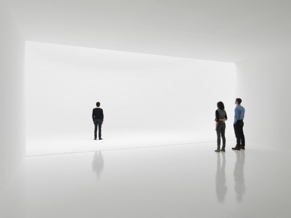
Heaven, yes, but with refugees from an insane asylum, as everyone was moving slowly and their booties caused them to shuffle. The effect of the lighting was so much like that of seamless photography background paper that everyone looked like part of a fashion shoot, and thus highlighted became inadvertent performers.
Roberto and I became fascinated with a young woman in our midst who was shuffling about in a particularly distracted way. Everything about her was slack—her mouth hung slightly open, rumpled clothing fell loosely over her heavy frame, and her hair looked as if she just gotten out of bed—in marked contrast to the art students she came with and the fashionable gallerinas. Roberto dubbed her Sloppy Girl. “Meds,” he whispered to me. Who was she? What was she doing there? Was she going to be okay?
Ultimately Sloppy Girl is what we remember and still talk about—not, perhaps what the artist intended.
(Also note that the people in the publicity shot above, courtesy of the gallery, are NOT wearing booties.)
(Also note that the people in the publicity shot above, courtesy of the gallery, are NOT wearing booties.)
October 10, 2011

Thomas Struth 2011 - courtesy Schirmer/Mosel
I just finished reading Janet Malcolm’s excellent article (New Yorker, September 26, 2011) on the photographer, Thomas Struth, whose 30-year survey I saw last July at the Whitechapel Gallery in London. I often cringe when art world outsiders attempt to write about art; editors can forget that it’s a specialized field like science or sports, with specialized practices and precedents. They might assign a music writer to write about art (as the Chicago Tribune did back in the day) but an art writer to write about football? Hardly. Outsiders tend to idolize and idealize the artist, make too much of technique (which can seem magical to them), and emphasize the wrong things—Anthony Lane’s 2003 article on Howard Hodgkin in the same magazine is a case in point: Lane, normally a perceptive film critic, made much of the fact that Hodgkin would date a piece over the years it took to make it, i.e. “1998-2002,” an utterly common artistic practice, and wrote “If you know Hodgkin’s work, you can spot it across a crowded room.” Uh, that’s called personal style.
Also, to a frightening degree, most writers of profiles (art and non-art) tend to be so cowed by their subjects that they rarely question or evaluate their statements. Malcolm, however, isn’t afraid to intelligently correct what she perceives as Struth’s “mischaracterization” of photo-realist painting, and point out how, while not a conscious influence, that work anticipated Struth’s generation of photographers.
The piece begins and ends with the story of Struth’s recently commissioned portrait of Queen Elizabeth and Prince Philip. The photograph is remarkable for its subtlety, not a quality usually associated with pictures of monarchs. Generally the poses are dry and formal or the opposite, smiling with dogs or small children, as if the photographer is trying to say, “See? Royals are human, too.” Instead Struth wraps vulnerability, power, and constraint into a single package. Seeing the reproduction (although with no indication of size, which turns out to be 59” x 79”) and learning about the sensitivity with which Struth approached the project gave me insight into his work to the point that I wished I could go back and see the Whitechapel show all over again. If all art writing were like that, I wouldn’t be so vehement on the subject.
The Struth piece reminded me how much I learned in the 23 years I spent working with TIME’s estimable collection of cover art (from Warhol to Alice Neel, Alex Katz, and Christo, with my hands-down favorite being Marisol’s sculpture of Bob Hope) and commissioning pieces from “gallery artists” (the only term I could come up with that would distinguish them from illustrators) for the covers. It seemed that when the subject was a given I could see the artist’s peculiar vision more clearly—the special twist that could turn yet another image of an over-exposed celebrity into a genuine work of art.
And speaking of teaching, as we were in the posts below, it comes as no surprise that Struth studied with Gerhard Richter (described by Struth as “ironic,” with “coded” language and behavior) and photography icons Bernd and Hilla Becher of whom he said:
The big pedagogical influence was that they introduced me and others to the history of photography and to its great figures. They were fantastic teachers…in the way that they demonstrated the complexity of connections. It was an outstanding thing that when you were with Bernd and Hilla they didn’t talk about photography alone. They talked about movies, journalism, literature—stuff that was very comprehensive and complex. For example a typical thing Bernd would say was “You have to understand the photographs of Atget as the visualization of Marcel Proust.”
Which leads me to the idea I’ve often fantasized about, that until specializing at the college graduate level, we should be teaching not subjects but eras—Warhol in the context of the moon landing, birth control pills, Catch-22, and Marshall McLuhan makes much more sense than as part of some artificial trajectory from Abstract Expressionism to Pop Art. When I was at Bennington I wanted to put together a multi-disciplinary class entitled “1968” (ideally to be followed by 1954, 1944, 1929, 1917, etc.) that would go into not just the cultural, political, and scientific events but what people were eating, what their houses looked like, their religious and educational practices, important legal disputes of the day, and so on.
Sometimes I think we’re still teaching everything like it’s 1890.
October 2, 2010
I find I have taken an inadvertent vacation from my blog—not for any particular reason, I just didn’t have any thoughts or opinions, which anyone who has known me for longer than five minutes will find difficult to believe. It happens rarely, but it does happen.
I did go to the Chelsea gallery openings and saw some shows I enjoyed (Joan Snyder, Judy Pfaff, and Jane Rosen) and others I thought were ridiculous (best left unsaid), as well as Gerhard Richter at the Drawing Center in SoHo, which I didn’t love but, regardless, found surprisingly inspiring. I bought the catalogue and when I came back to my studio, all I wanted to do was draw.
I also discovered a new art material: PanPastels. A while ago, out of the blue, the company sent me some samples to try, and I recently unearthed them. They call them “painting pastels,” and the colors, which are highly pigmented, come in little pots like rouge and are not overly dusty, so it’s like painting, but without the muss and fuss. I love that I can just up and leave the drawing board and when I come back hours later my brushes haven’t gone stiff, and nothing has dried up. They can be purchased in individual colors ($5.14 each at Dick Blick) and in sets, and my only complaint is that the sets don’t really contain what I want (you have to order a set of 20 to get one that contains orange!) and if they do there are duplicates (Payne’s Gray appears in both the gray and the blue sets of five each). But it’s a small quibble, and every day I compulsively order more.

I also became completely hooked on a book—a fascinating, in-depth (875 pages), and completely annotated biography of 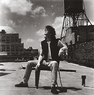

Lou Reed on my roof, in a chair by Phillippe Starck. Photo by Christian Coigny for Vitra, ca. sometime in the 90s
December 18, 2009
Peter Schjeldahl, "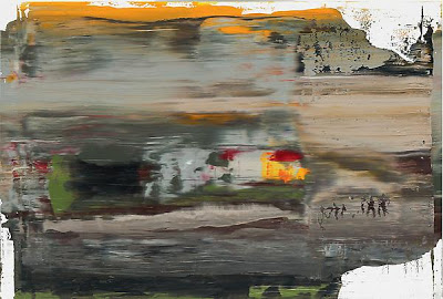 Gerhard Richter, Abstract Painting (894-1), 2005 11 3/4 x 17 3/8
 Gerhard Richter, Abstract Painting (894-1), 2005 11 3/4 x 17 3/8
 If, after the Orozco show, you want to indulge your senses in a retrograde manner, hop on over to the same place we first saw those Dannon lids, the Marian Goodman Gallery, and wallow in Gerhard Richter’s gorgeous scraped abstractions, up through January 9th.
October 9, 2007
Have I been whining a lot? I guess so, because today Roberto came over and said he didn’t think my painting was as bad as he'd expected. He said the color was good, that the alizarin yellow turned out to be great as underpainting—but that I’m painting what I want to see rather than what’s really there. His exact words were, “It’s naïve, but not in a good way.” Only a true friend would say that. Of course, I knew he was right; I was just hoping that I could fool him the way I was trying to fool myself into thinking this painting was Gerhard Richter-esque when it’s really more like Maurice Sendak, minus the Wild Things.
I’d hoped for a happy ending—I was committed to the idea that a painting blog should be inspirational—but instead I’m going to take Roberto’s advice, retire this thing for a while and start another. And this time I’ll try not to be so histrionic about it.
Meanwhile there’s Jeanette and Erica’s wedding and an article to write for Art in America on the Marisol show that’s up at Neuhoff Edelman Gallery (41 West 57th) until October 27th. The great thing about having two vocations is that it makes for very productive procrastination: I do some of my best painting when I’m supposed to be writing and, conversely, having a deadline gives me a great excuse not to paint.
My reviews of Myron Stout and Jo Baer are in this month’s (October) Art in America.