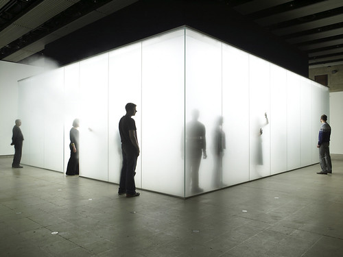
Sculpture
Art Vent Letting the Fresh Air In
.jpg)


 There are people in the world who spend much of their time conjuring up geometric forms no one has used before. One such person is my previously-mentioned friend, Einar Thorsteinn, whose configurations often appear in Olafur Eliasson’s work. Einar just sent me these photos (click to enlarge) of himself in Olafur’s studio, working with one of his latest, which has the working title of “MoMA Joint” because it’s intended for use in Olafur’s upcoming survey exhibition at the Museum of Modern Art. Einar suggests that the stackable form can have other, more practical applications, such as being cast in concrete for the walls of a house, where the openings could become windows.
 The level of rigor Einar contributes to Olafur's work was what I found lacking in the wire sculptures in Antony Gormley’s recent show at Sean Kelly (up through December 1st). I want to like Gormley’s work because I’ve never forgotten the first piece I saw of his in 1991--entitled Field, it consisted of 35,000 handmade clay figures assembled on the gallery floor, all of whom seemed to be beseeching me. With overtones of war and poverty—even though those issues weren’t addressed directly, or perhaps because they weren’t—it was quite moving.


Perhaps because I now identify with Nevelson—but more so because I’ve gained so much artistically from knowledge of her work—I was annoyed when, in my research, I read Mario Naves’s review (The New York Observer, May 14th) of the her Jewish Museum retrospective (on view until September 16th) which begins:
Upon opening the catalog for The Sculpture of Louise Nevelson: Constructing a Legend....you're immediately confronted with a photo of the artist in early middle age, her features retouched to emphasize the lines in her face.

This is quite a stretch to make a case for image-building. When I contacted the museum, I learned the photograph was retouched, but by whom and for what reason is not known, and whether or not it emphasizes the lines in Nevelson’s face is a matter of opinion. It’s possible, they say, that the retouching could have been done to add shadow and contrast to areas that were washed out by the lighting. There’s no date on the photo, but in it Nevelson appears to be in her middle-forties and the style of make-up would also indicate that it was taken in the 1940s, at least twenty years before she became a public figure. Naves says:
She looks to the viewer unsmiling and with unflinching self-possession.
Oooh self-possession! Bad. Do we complain or even comment that Picasso was self-possessed and didn't make cute for the camera? And that Mondrian! Always so fucking serious!
Naves goes on:
More portraits follow in chronological order, bearing witness to Nevelson’s transformation from working artist, dressed in a white wool sweater and cap, to a creature with (to put it mildly) a distinct sense of fashion. In the last photograph, Robert Mapplethorpe’s portrait of the 87-year-old Nevelson, she’s as haughty and garish as Norma Desmond in Sunset Boulevard.
Naves makes it seem as if Nevelson was unwittingly making herself ridiculous, where if you compare the film still of Norma Desmond here with the Mapplethorpe here, it seems more likely that the similarlity was intended, and that Mapplethorpe and Nevelson were having fun riffing on a classic image.
Naves backtracks just a bit by saying:
Unlike Gloria Swanson’s faded-movie queen character, Nevelson (1899-1988) was very much self-aware. She knew that cultivating an image, however contrived or flamboyant, would earn her recognition. Her regal bearing, bandanas, dramatic gestures and spidery false eyelashes created an identifiable persona: the Pharonic Grande Dame of Sculpture. Nevelson was, in her own way, as P.R.-savvy as Salvador Dali or Liberace.
So being "very much self-aware" is all that separates Nevelson from Norma Desmond? How about that Norma Desmond was pathetic, desperate and needy, a woman who gave a party to which no one came, while Nevelson was celebrated, in her power? Everyone wanted to be at her party. At the time of the Mapplethorpe photo, Nevelson was the epitome of a satisfied, fully-realized woman. And garish? Whatever degree of garish she was, it landed her on the Best-Dressed List. And then the times, the seventies and eighties, were pretty garish all around. I wonder what Mario Naves was wearing back then, when he was in his teens and twenties. Button-downs and Oxfords? It was an era when people, especially artists, used style to express themselves, unlike today when art is big business and everyone’s cowed into Prada.
Okay, on to the idea that Nevelson’s look was a P.R. ploy. If it was such a great scheme, then how come it took so long—like 20 to 30 years—to take effect? Those who have done their homework, who’ve read Laurie Lisle’s wonderful biography Louise Nevelson: A Passionate Life know that Nevelson’s style was with her from the beginning, a source of discomfort for her husband in her pre-art years. Lisle writes: “While Charles dressed conservatively, Louise liked to create flamboyant outfits for herself, like a dress decorated with a dickie made from a wedding napkin. He often insisted she return purchased outfits that he disliked, and he began to be embarrassed to walk down the street with her.”
Imagined conversation:
Charles: Oh my God, Louise, are you going to go out looking like that?
Louise: Don’t worry, Chuckie, I know what I’m doing. When I leave you I’m going to study art, and in 50 years I’ll be famous and this is the look that’s going to put me over.
Anyway, what’s wrong with wanting attention and going about it in an artful way? Nevelson was never anything but elegant. And being a tall, dark woman with excellent bearing and an acute awareness of her body allowed her to pull almost anything off. The day I went to interview her, a few months before she died at 89, she was wearing an impeccable man-tailored suit of crisp blue ikot fabric (a Japanese-ish cotten with a thread-dyed geometric pattern), what looked like men’s black patent leather wing-tip lace-up shoes, and a fabulous fur coat. Then and there I decided that older women who go the fluffy, ultra-feminine route look like men in drag, and that when I’m eighty I’m going to have men’s suits made for me, just like Louise.
But back to Naves:
The girded accumulations of individual components are artful rather than lively. Overall, they’re rather boring. Butting a dozen or so boxes up against or on top of each other results not in great complexity, but homogeneity.
The artist, Willie Cole, seen in a video at the end of the exhibition, speaks of Nevelson’s art in terms of “embalming.” Inadvertently, but with devastating precision, Mr. Cole hits the black and rusty nail on the head. Nevelson’s pieces aren’t memento mort, they’re just dead.
Their handsomeness is derived from their inertia. Nowhere is this clearer than Mrs. N’s Palace (1964-77), a shack-like enclosure that’s less Temple of Dendur than house of horrors. Nevelson’s gift for juxtaposition is undone by her theatricality. Here she replaces stoic spectacle with outright hokum. It’s funereal bombast with mood lighting—a sad and all-but-laughable achievement.
Not for nothing is Nevelson hailed as a progenitor of a numb-to-its core movement like minimalism, or the didactic excesses of most installation art. Nevelson’s sculpture ultimately privileges the artist’s prerogatives over art’s vitality. We’re left with monuments of personality rather than homages to life. The latter can be picked out here and there, and to impressive effect. Don’t fool yourself, though. Nevelson the Legend wins out over Nevelson the Artist. It’s a disheartening denouement.
I agree with Naves about Mrs. N’s Palace, although I find the use of the word “shack,” which implies something crude, in disrepair, or hastily thrown-together, inappropriate. I try not, however, to evaluate artists on the basis of their least successful work (instead of the "homages to life...that can be picked out here and there, and to impressive effect") and wonder why he didn’t mention the other room-size piece, Dawn’s Wedding Feast, which happens to be white. And there’s a contradiction here—Naves admits Nevelson is “hailed as a progenitor” yet insists she made her reputation on the basis of her persona.
Note to women artists: Don’t be too minimal; don’t be too theatrical. Don't let too much personality show in your work. Make sure that you smile a lot, act conservatively, dress conservatively, and, above all, don’t be old. I guess Nevelson should have gotten Scaasi, her favorite couturier, to design her a burka.
Then this bit:
At first glance, it seems natural to classify Laib as a minimalist, but his work strays far from minimalist ideology. Minimalist sculpture deals with intellectual investigation of space. It’s about ideas. Once the artist has determined the concept, the making of the artwork can easily be passed on to assistants….
Huh?
To stress again that there’s no aesthetic experience to be had in minimal art (and, I suppose, therefore, no investigation of space in Wolfgang’s work) Good continues:
The difference between Laib’s work and most minimal art comes out in the viewer’s reactions. A cavernous room that houses minuscule works composed of pollen is arresting to more than just the intellect. It demands thoughtful reflection and meditation. As viewers enter and leave the space, rarely can a whisper be heard….
Good goes on about the artist, the artist’s background, what the artist thinks, how he lives, what the work looks like, sounds like, smells like even, talks about how the full impact is "hard to believe until one experiences it firsthand" (like most art?) yet cites no sources nor mentions any specific exhibitions to indicate what work he might have seen. Appearing to have been culled from unidentified secondary material, the piece reads like a high school report:
…Laib has chosen at times to install [his work] beneath the vaulted ceilings of European cathedrals. There it projects a reverent stillness that resonates in the ancient sacred spaces….
Really? The writer was there? Where? What cathedral? Is he taking someone else’s word for it? Or, perhaps, fantasizing about what it might be like?
Then...
For some artists, the choice of medium is more or less a neutral decision. Deciding to paint in oil or cast in bronze hardly draws extra attention. When an artist selects sifted pollen or poured milk, however, the work is charged with special meaning before he begins.
Damn! I knew I should have held onto that squirrel shit.

My first experience of the inspired confluence of art and architecture was in the early eighties at a Pop Art exhibition in Venice’s Palazzo Grassi, where a giant Warhol Mao, at least 20-feet-tall, was installed in an impossibly ornate room that I remember as being taller than it was wide and ringed with several stories of balconies. Ever since, my impatience with the white box has been growing. I think it's one of those art world assumptions—having to do with the notion that art is sacrosanct and should not be interfered with—that took hold and now, never questioned, is self-perpetuating. (Along with another of my bugaboos, the idea that items in a retrospective need necessarily be installed in chronological order.)
I know that, as an artist, I’m not supposed to like Frank Lloyd Wright’s Guggenheim, but I do, and not just because I welcome any opportunity to walk uphill. It always feels special to go there, an event, and more than any other museum, I have distinct memories of not only the works I’ve seen there, but where and how they were placed, how I felt coming upon them, and how they looked from a distance, across the atrium. What other museum offers you a view of something from eighty (I’m guessing here) feet away? In the Guggenheim you view works one at a time, whereas in the white box you must make choices about what to do with your attention, so whenever you’re looking at something you must always be conscious of what you’re not looking at as well.
Thus my irritation with the Serra installation at MoMA (the white box plus track lighting—ugh!) and don’t even get me started on the Brice Marden show. All right, get me started. I like Marden’s paintings. I’ve come upon a single Marden somewhere and been blown away, and I remember seeing a perfectly exquisite Marden show at the Serpentine Gallery in London. But I wouldn’t want to be Marden. To have to get up in the morning and face those canvases day after day? (As a rock musician friend said, after I played him Philip Glass, “It’s a dirty job, but somebody has to do it.”). And when you combine repetitive paintings with a repetitive installation you come up with something you want to walk through very fast. Curators who insist on mounting the works in chronological order (and I’m not saying it might not work in some cases—as Robert Irwin says, “Sometimes the best solution is the cannon on the green”) are making a statement that values development over aesthetic experience. In Marden's MoMA exhibition, I would have liked to see the ribbon paintings interspersed with the monochromatic panel paintings; this would have created a textured environment where each piece could be seen on its own merits, without the distraction of an almost identical one next to it. To find out about Marden's process of development, there could have been a handout and/or wall text at the end, illustrated with small reproductions, that listed the order in which they were created.
An example of a thoughtfully installed show that doesn’t lean heavily on chronology is the Louise Nevelson retrospective at the Jewish Museum (on view into September). And according to Art Daily, Michael Govan, formerly of the Dia Foundation and now the director at the Los Angeles County Museum, is intending to use artists—including James Turrell and Jorge Pardo—as designers. What if one artist were to design the exhibition space for another? How cool would that be? I’d let Robert Irwin design a space for my paintings! Rem Koolhaas designed an exhibition for Terry Winters in SoHo once upon a time, which could have been more successful (except I do remember it clearly, which is something), but given how fabulous his Student Center is at the Illinois Institute of Technology (below)—when you are in Chicago, don’t miss it!—if he volunteered I’d let him have a go as well.


Tuesday was the press preview for the Richard Serra show at MoMA (up through September 10). First, of course, I had to go to the MoMA Design Store, but they were out of the key chains I wanted. Anyway, I got to the museum in time to witness Serra being introduced as one of the greatest sculptors of our time, which he undoubtedly is—if not the greatest—and I must grudgingly go along with that assessment.
I used to hate Serra’s work, finding it ego-driven and misanthropic in the extreme. He’d set up four heavy metal plates and lean them against one another so they formed a cube that looked as if it might collapse at any moment; it seemed to be all about very heavy stuff that could possibly fall on you. Then a piece did kill a rigger who was installing it--and that Serra would later make drawings entitled Dead Weight and show them in the same gallery space where that tragedy occurred seemed the height of insensitivity, not to speak of bad taste. In the Tilted Arc controversy in the eighties, I agreed with the government workers who wanted the sculpture removed from the plaza in front of the building in which they worked. Who wants to have lunch in the shadow of a big metal plate that looks if it could fall any minute? And since when does the term “site-specific” refer only the physical aspects of the place and not take into account the wellbeing of the people who use it? Art is important, but not that important.
However just as I believe it shouldn’t make any difference if an artist has Alzheimer’s (see Something to look forward to below), I also don’t think the personality of the artist—whether he’s anti-Semitic like Richard Wagner or just a hard s.o.b. like Serra--has any place in the evaluation of the work. The work is the work. So when Serra began to make pieces that really spoke to me—the Torqued Elipses in the nineties—I had to make myself forget all that other stuff. Where the earlier sculpture underscored what we already know about steel—that it’s heavy, flat, and solid and can kill you—the many-tonned Torqued Elipses work against the material’s innate qualities to become lyrical, pliable, curving, soaring and, like Gehry’s architecture, solidly grounded as much as they are unbalanced and unpredictable. When the Torqued Elipses were shown at the Dia Foundation they were a revelation. And the pieces in the sculpture garden at MoMA are wonderfully sited—the steel plays off the marble garden floor, the foliage, the sky, and the vast cityscape. However Serra’s monsters loose their vitality when they’re incarcerated in the white windowless rectangles of the interior galleries and lit with generic track lighting (really, with a gazillion dollars to play with, can’t MoMA come up with anything better?) so that they ultimately end up looking like so many caged hippos. In an effort to avoid creating a context that wouldn't compete with the sculpture, the museum setting has drained them of all life.
Like the government workers in the Federal Building, they need a place to breathe.