The New Yorker
Art Vent Letting the Fresh Air In
December 18, 2009
Peter Schjeldahl, "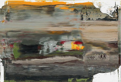 Gerhard Richter, Abstract Painting (894-1), 2005 11 3/4 x 17 3/8
 Gerhard Richter, Abstract Painting (894-1), 2005 11 3/4 x 17 3/8
 If, after the Orozco show, you want to indulge your senses in a retrograde manner, hop on over to the same place we first saw those Dannon lids, the Marian Goodman Gallery, and wallow in Gerhard Richter’s gorgeous scraped abstractions, up through January 9th.
Comments (9)
August 15, 2009

The other day, thrilling to the new Silversun Pickups while driving on the Mass Pike to Boston, I found myself wishing that I could get the same feeling from art—the exhilaration, the physical surge in the chest—that happens when I hear great music. Roberto and I were on our way to the Institute of Contemporary Art (ICA) to finally catch Shepard Fairey’s show, “Supply and Demand,” before its closing tomorrow. My attempts to attend the winter opening were foiled by the weather, the following months were filled with travel and constant precipitation, so now—rain or no rain—we were making the two–hour drive.
What did I expect? Well I was a big fan of Shepard Fairey’s graphic work, and I’ve always been captivated by the way graffiti and street art in general can add (as in this photo I recently took in Reykjavik) a layer of poetry to the gritty urban landscape.
What did I expect? Well I was a big fan of Shepard Fairey’s graphic work, and I’ve always been captivated by the way graffiti and street art in general can add (as in this photo I recently took in Reykjavik) a layer of poetry to the gritty urban landscape.
 As consultant, I was enamored enough to suggest Fairey to TIME for the 2007 “Person of the Year” cover of Putin (it ultimately ran on the inside, and he did a new image of Obama for 2008’s cover) and loved his iconic Obama poster, the way it captured the spirit of the man, the campaign and the times, and how simply beautiful it was. I also admired Fairey’s philosophy—in the ridiculous brouhaha over his appropriation of the AP image of Obama (exacerbated by a news media that insists on reproducing the AP photograph not as it originally appeared but as Fairey cropped it) hardly anyone has pointed out that Fairey never intended the image as a money-maker, but made it available for free on his Web site.
However I’d also read Peter Schjeldahl’s New Yorker review, where he described the work in the show as “formulaic,” “slick and resistible,” and Christopher Knight’s review in the LA Times that talked about Fairey’s “limited pictorial vocabulary.”
Therefore I was not prepared for Art with a capital A, or a rush similar to the one I’d just gotten from the Silversun Pickups—or to find that most everyone I talked to afterwards who’d seen the show shared my enthusiasm, including a museum administrator who put it in the top five of museum shows she’s seen…ever.
It was gorgeous.
Photographs cannot reproduce the nuance, depth and complexity of Fairey’s surfaces. Clearly his inspiration comes from the street—the way peeling posters can reveal chance fragments from earlier ones, or how signs painted on the sides of buildings often wear away to expose a jumble of previous messages—yet the result is elegant and sophisticated, as well as soft and sensual. Further, Fairey wrests all this texture and nuance from what every artist knows is the most hard-edged and unforgiving of media: silkscreen.

What I want from art is that perfect marriage of concept and execution, both so fully developed that, as viewers, we are aware of neither, but powerfully in the experience. Yet I hardly ever find it—so much of what is offered seems half-realized, as if the artist is afraid to take a stand, afraid to actually make something, afraid to commit him/her self fully to an image, an object. Execution is either overdone relative to the flimsiness of the idea, or too casually rendered, as if the idea in itself should be enough. I want to see work that holds up from afar but gives me something to look at up close. I want to see art that looks as if the artist cares.
 Packed with complexity and contradiction as well as humor, Fairey’s work does all these things. We stay with his messages about money, power and war because they are embedded in a richness of visual detail, the sumptuous mélange of influences (Russian Constructivism, Middle Eastern art, Pop Art, official engravings such as paper money and stamps, advertising, to name a few) that adds up to his very singular style.
 It felt like a feast.
Afterwards we gave the permanent collection a run-through, but following Fairey everything seemed tepid and flat. Then, after a delicious lunch on the windy outdoor terrace overlooking the Charles, we went through the exhibition again. I attempted to get a press kit, images for this blog and to present for reviews, and to find out if the show is traveling, but was told that the administrative, curatorial and press staff were all on vacation that Thursday afternoon and photographs, even by press, were prohibited. (Photography prohibited? In a Shepard Fairey exhibition? )
We’d intended to augment our Boston visit with a stop at the Isabella Steward Gardner Museum and some fabulous seafood dinner, but decided instead to just get back in the car and drive home.
We were full.
 All Shepard Fairey images borrowed from the Web, by necessity.
---
Silverson Pickups' "Panic Switch"
May 26, 2009
I have a love/hate relationship with my iPhone. On the one hand it’s like the limb I never knew I'd been missing, but when it breaks down…well, it’s only broken down once in the eight months or so I’ve had it, but having gone through three or four iPods on one warranty, I’m not optimistic. So last Thursday I was in Grand Central Station withdrawing money from the brand-new Chase ATMs (they’re supposed to be touch-sensitive but you have to stab at each choice at least ten times—designed to sense frustration levels rather than fingertip heat, they only work when you’re ready to smash the screen) and it dispensed $100 when I’d clearly pressed the $200 indicator (never, never will I withdraw money again without getting—and keeping—the receipt). I tried immediately to call the number on the wall, but my iPhone said “No Service.” I walked outside, and still “No Service.” I tried a pay phone on the street (they still have them) but the Chase rep couldn’t hear me. When, an hour later, I finally got through on my land line, I found out that Chase had—whew!—only deducted $100. But then I had to go to the Apple Store for two hours, go get my computer and bring it back for another two hours, after which I had a brand new iPhone with all my data intact...except the apps. Once you’ve purchased an app you can download it again for free, but any un-backed-up app data will be lost.
Lost! It was a crushing moment because then and only then did I realize that my true métier isn’t actual but virtual painting with the iPhone app called Brushes, and the masterpieces I’d made with it were gone forever. I love my Brushes “paintings”—really paintings over photos, just like Gerhard Richter—but have had to reluctantly acknowledge that yet again, the thing I do best has no material application. I thought they’d make great Iris prints, so emailed them off to a friend who has a gallery and does such things, but she was not impressed. That may change, however, and Brushes may yet become respectable, because it turns out that this week’s New Yorker cover by Jorge Columbo was done on an iPhone with Brushes. You can see it here, with a step-by-step video of how he drew it (makes it look easier, though, because it doesn’t include the “undos”)
Here are two of mine, which I was smart enough to save:

June 22, 2008
 Installation view, "Who's Afraid of Jasper Johns," at Tony Shafrazi Gallery.
I’m catching up on my reading, plowing through the magazines that accumulate on my kitchen counter (I swear they reproduce overnight—I come down in the morning to find ten magazines where there was only one the night before). Not to be missed is Peter Schjeldahl’s summing up of Jeff Koons in The New Yorker (June 9 & 16) on the occasion of Koons’s retrospective at the Museum of Contemporary Art in Chicago, which begins, “There’s something nightmarish about Jeff Koons” and ends with “We might wish for a better artist to manifest our time, but that would amount to wanting a better time” yet acknowledges the “material mastery, conceptual perfect pitch, and idealistic beauty of the objects on display in Chicago.” Yup, sometimes Koons fakes it and other times he makes it. Schjeldahl doesn’t make sense of the Koons phenomenon, as if anyone could, but for the first time I found myself reading about Koons while nodding my head in agreement.
Then there’s Jerry Saltz’s review in New York (June 25) of the Gavin Brown/Urs Fischer conceived “group show” entitled “Who’s Afraid of Jasper Johns” at Tony Shafrazi Gallery (through July 12th), a mishmash of authenticity, appropriation and reproduction that Roberta Smith called “demonically aerobic to brain and eye” and Saltz wrote is “like some mad replicating vision machine, or a walk-in Louise Lawler” that was intended to “set art free from the context of the white box.” I’m as weary of the “white box” as anyone, but I don’t find the tag sale aesthetic of “Who’s Afraid,” where every image seems to cancel out every other image, a viable replacement. Howard Halle, in Time Out, called it a “deeply cynical meditation on the deeply cynical nature of the contemporary art world.” To me it felt toxic, was toxic—given the out-gassing fumes from Ron Pruitt’s plastic bag “waterfall” and Rudolf Stingel’s new but visitor-smudged white wall-to-wall carpeting—an environment to be exited as soon as possible.
The back-story is much more interesting. I mean if you were to write a novel about a guy who sprays paint on Picasso’s Guernica at MoMA and then goes on to fame and fortune as purveyor of graffiti-based art, it would be just too cheesy. It’s a story that I've always felt revealed the rotten core of the art world. But to bring it up-to-date, here’s Shafrazi, 34 years later, at the after-party for ”Who’s Afraid,” being presented with a birthday cake that’s a giant replica of the Guernica.
Saltz writes: Brown climbed atop a table and, amid much yelling, toasted Shafrazi. He then thrust a cake decorator filled with red icing into Shafrazi’s hands. As the crowd screamed, Brown implored, “Write, Tony, Write!” Shafrazi started moving the device over the cake. Slowly he wrote the words I AM SORRY. Time stood still. It was like an angel of redemption had entered the room to take away Shafrazi’s guilt. The room went silent. I was shocked. The Shafrazi began writing again. He wrote one more word: NOT! It was like the Sopranos finale. Just as you thought everything was going to change, everything became more of what it already was.
And that sums up the exhibition: something that purports to be new and different but is really just more of the same old.
January 28, 2008
This week in The New Yorker (January 28, 2008) Calvin Tomkins writes about John Currin and his pornographic paintings, a new group to be exhibited in London at the Sadie Coles gallery in March. It made me think of Currin’s show around this time last year at Gagosian uptown, which I went to see only at the last minute. While many people I respect, including Peter Schjeldahl, have long thought that Currin is an important artist, I never got it. When once, in conversation, Schjeldahl mentioned how much he admired Currin’s technical ability, I began wonder have we, in the art world, such low expectations that ability comes as a surprise? In the field of illustration it’s a given—you can’t get in the door without it—and to compound the problem for me, Currin’s style has always seemed uncomfortably close to that of illustrator C.F. Payne who, having worked for TIME and Rolling Stone, is now doing the back covers of Reader’s Digest and threatening to turn into the Norman Rockwell of our time.
I believe execution is only one component of painting, and important only to the degree that it supports the content. God knows, painters with great technical ability have been using it in the service of poor image choices since the beginning of painting. Ideally, in painting or any form of art, execution and concept should merge so completely that we’re no longer aware of either; we’re not thinking, “How did he do that?” or “What a cool idea!” but are one with an experience that goes beyond words, beyond thinking.
Therefore Currin’s technique didn’t interest me because his content didn’t interest me; I found it cynical, mannered, and soul-less in the extreme. And when I read that this most recent show was “long on pornography,” getting on the Lex to see it began to seem even more like an effort not worth undertaking. Am I anti-porn? Not necessarily, although it’s not an active part of my life, and whatever prurient interest it may once have held has been dulled by the sheer amount of it in galleries. That, plus the waves of porn-derived art that seem to hit, every few years, the schools in which I occasionally teach, have left me pretty porn-ed out. I feel about porn the way I do about Christmas music, which is that over-exposure has rendered me incapable of mustering any response whatsoever.
So the Currin exhibition had three strikes against it—besides being Currin, it was uptown and pornographic—until I read a short panegyric by Schjeldahl in The New Yorker, accompanied by a tiny reproduction of a straight-forward portrait of the artist’s young son, one of two such paintings in the exhibition, which Schjeldahl described simply as “ravishing.” It was enough to get me on the subway.

And it was worth it. The two small paintings, interspersed inexplicably among graphically sexual ones (since I don’t believe in psychoanalyzing artists or attempting to guess their intentions, I’m not going to comment on this bizarre aspect of the exhibition), were painted with all the attention and tenderness of Chardin, and indescribably beautiful. Taking up the challenge in the artists’ adage that the hardest subjects to paint are sunsets and babies, Currin’s skill enabled him to avoid the obvious trap of sentimentality; far from sappy, these paintings are lovingly observed and alive with all of the aching delight of parenthood. They were enough to make me swallow my words and admit to myself (and now, finally, to Schjeldahl) that Currin is, or rather can be, a wonderful painter.
I believe execution is only one component of painting, and important only to the degree that it supports the content. God knows, painters with great technical ability have been using it in the service of poor image choices since the beginning of painting. Ideally, in painting or any form of art, execution and concept should merge so completely that we’re no longer aware of either; we’re not thinking, “How did he do that?” or “What a cool idea!” but are one with an experience that goes beyond words, beyond thinking.
Therefore Currin’s technique didn’t interest me because his content didn’t interest me; I found it cynical, mannered, and soul-less in the extreme. And when I read that this most recent show was “long on pornography,” getting on the Lex to see it began to seem even more like an effort not worth undertaking. Am I anti-porn? Not necessarily, although it’s not an active part of my life, and whatever prurient interest it may once have held has been dulled by the sheer amount of it in galleries. That, plus the waves of porn-derived art that seem to hit, every few years, the schools in which I occasionally teach, have left me pretty porn-ed out. I feel about porn the way I do about Christmas music, which is that over-exposure has rendered me incapable of mustering any response whatsoever.
So the Currin exhibition had three strikes against it—besides being Currin, it was uptown and pornographic—until I read a short panegyric by Schjeldahl in The New Yorker, accompanied by a tiny reproduction of a straight-forward portrait of the artist’s young son, one of two such paintings in the exhibition, which Schjeldahl described simply as “ravishing.” It was enough to get me on the subway.
And it was worth it. The two small paintings, interspersed inexplicably among graphically sexual ones (since I don’t believe in psychoanalyzing artists or attempting to guess their intentions, I’m not going to comment on this bizarre aspect of the exhibition), were painted with all the attention and tenderness of Chardin, and indescribably beautiful. Taking up the challenge in the artists’ adage that the hardest subjects to paint are sunsets and babies, Currin’s skill enabled him to avoid the obvious trap of sentimentality; far from sappy, these paintings are lovingly observed and alive with all of the aching delight of parenthood. They were enough to make me swallow my words and admit to myself (and now, finally, to Schjeldahl) that Currin is, or rather can be, a wonderful painter.
Time changes things in weird ways, so now the truly radical act is to paint something close to your heart—in this case, your infant son. I’m reminded of a conversation between Gerhard Richter and Rob Storr, the curator of Richter’s 2002 exhibition at MoMA, as it was recorded in Art in America:
RS: There is another body of work which is perhaps more surprising than the landscapes in certain ways—the paintings you made in 1995 of your wife and young child. These are very unexpected paintings.
GR: Maybe because there are so many of them.
RS: Both the number and the subject.
GR: The subject? Because there are children in the painting?
RS: Yes
GR: I can’t quite understand why this should be so extraordinary.
RS: It’s unexpected because it seems very private.
GR: Very private, yes. The only difference is that I have become more shameless. I am not as ashamed anymore, and I am not afraid anymore. My fears have abated somewhat. I don’t feel as if I have to behave properly. Somehow I finally understood that I am allowed to do what I want.
I’m not suggesting that everyone go out and start painting their kids—that would be awful. But I am saying that forms of art other than those recognized by the academicized avant garde may still be relevant, and that there are more possibilities for content than that derived from the media, a trend that has gone on at least twenty-five years too long. It just happens that I’m reading Alex Ross’s The Rest is Noise: Listening to the Twentieth Century, and came across a quote from composer Morton Feldman who said something like, “What looks radical may be conservative and what seems conservative may be radical” (I’ve lost the exact reference and will correct it when I find it). And this paragraph (p.354):
“Everything begins in mystique and ends in politics,” wrote the French poet Charles Peguy in 1910. Morton Feldman, the maverick modernist who loved Sibelius, applied this epigram to twentieth century music, describing how grandiose ideas are made ordinary with the passage of time and become fodder for a power struggle among ideologues and pedants. “Unfortunately for most people who pursue art, ideas become their opium,” Feldman said, “There’s no security to be one’s self.”
January 17, 2008
Because I was ranting earlier (on December 27th, to be precise) about how tired I am of stories, particularly in The New Yorker, about dysfunctional relationships that never go anywhere, when they publish one worth reading, I feel it’s my duty to mention it. The story is Wakefield, by E. L. Doctorow, and it’s in the January 14th issue. Satisfyingly long, it is indeed about a dysfunctional relationship, and it makes me wonder if all those other dysfunctional relationships just weren’t dysfunctional enough to be truly interesting. This one really makes you squirm, and that’s all I’ll say about it.
November 16, 2007
Calvin Tomkins is back in the November 12th issue of The New Yorker with a profile of art power broker Jeffrey Deitch. Again it’s all about the question, who defines the art of our age? Now it's clearly the collectors. I wonder, however, when has commerce ever determined great art? People talk about how patrons used to commission artists, as if that were comparable, but Lorenzo de Medici wasn’t into Michelangelo for his resale value.
One reason the market has taken over, in the opinions of Deitch and others, is that critics and museum curators no longer clarify and define the main currents in recent art. In the nineteen-fifties, when hardly anybody was buying contemporary art, a handful of influential critics (Clement Greenberg, Harold Rosenberg, and one or two others) told us which artists mattered. The sixties changed that. Pop art, minimalist art, and a host of other developments caught the critics off guard, and for a decade or more the artists filled the critic’s role; Leo Castelli and other leading dealers made decisions mainly by listening to artists. Increasingly, though, auction houses, with their slick marketing techniques, were becoming the primary arbiters of quality. “I know a lot of collectors who look to the auction catalogues to define contemporary art today,” Deitch said recently. “The museums are not really articulating this in a coherent way. The market provides the structure, and when you ask who are the major artists, it’s basically, “What are the prices?”….
…A few weeks ago, over dinner in New York, I asked Deitch if he though that contemporary art was good enough to justify the astonishing prices being paid for it. “But that’s a question I wanted to ask you!” he said.
Here Tomkins truly drops the ball. Of course Deitch thinks this is a Golden Age, comparable to “the sixties, the forties, or the years around 1910” but what does Tomkins think? He never tells us, which makes him complicit in the whole scenario. Here is one of the best art writers of our time, who’s observed the scene for nearly fifty years, and he’s holding back? Why? Is it to keep the favor of his sources? Why has what we really think become such a desperately held secret?
September 19, 2007
September 5th was the opening of Olafur Eliasson’s mid-career survey at the San Francisco Museum of Modern Art, and I wasn’t there, mostly because I couldn’t bear to leave my little corner of Berkshire heaven. I’m not ready for the art world season to start, not just yet. God was, and is, rewarding us with the most fabulous weather and I’m convinced no art or art-related event could match the perfection of an early evening dip in the cool and tranquil Green River. Besides, Einar and Manuela came here on their way back to Iceland and then Berlin, with a full report.
Olafur, I predict, is on his way to establishing himself as a household name, and when the show travels to the Museum of Modern Art and P.S. 1 in April, and later the Dallas Museum of Art, I’ll be curious to see how he handles the media blitz that’s sure to follow. Up until now, he’s managed to remain aloof and keep the emphasis focused on the art—with the exception of Cynthia Zarin’s profile in The New Yorker (November 13, 2006--not yet available online).
Zarin is a New Yorker staff writer, and it seemed as if she didn’t have a sufficient art background and did little research, depending almost entirely on her interviews for information. A friend’s comment was “When you’re an expert, you always find something wrong” but I disagree. I mean, this is The New Yorker, which I expect to query the experts or, at the very least, read what’s been written about the subject. Because I thought of The New Yorker as a standard, discovering that it was fallible was a crisis of faith, like that moment in childhood when you first discover your parents could be wrong. The worst part was that this jumble of mis-emphasis and misinformation was held together with a gloss of the sharp and engaging writing for which The New Yorker is justly renowned, but which I now see as simply style. For instance Zarin absolutely nailed it when she described Olafur as having, “the slightly crumpled look of a shop teacher at a progressive school” but treated the work itself as nothing more than a by-product of his personality.
This was the gist of my letter to the magazine, which was not published:
To the editor:
Because I feel the magazine and its readers are capable of looking at issues in depth, I was sorry that the profile by Cynthia Zarin about the artist Olafur Eliasson concentrated on his personality and process rather than the art and the philosophy behind it—and without sufficient description of the art, you have no idea why such attention is being given to it. It is especially necessary in the case of Eliasson’s work because, since most of his work is temporary and not reproducible, the number of people who have actually seen it is small.
Zarin mentions Eliasson’s relationship to the artists “Robert Irwin and James Turrell and the idea of ‘seeing yourself seeing’” but does not explain this concept or describe how it plays out in the actual work. Later she notes that Eliasson was “deeply affected by the work of the phenomenologist philosophers, especially Edmund Husserl—with their emphasis on the individual experience of reality—and by Lawrence Wechsler’s biography of Robert Irwin, Seeing is Forgetting the Name of the Thing One Sees—without going into any greater detail or telling us what it was about the Wechsler book that so affected Eliasson. The questions Eliasson is seen asking himself are presented more as musings than essential to an overarching philosophical inquiry.
In discussing Eliasson’s Weather Project at the Tate Modern, Zarin does not mention how, in the wake of its extraordinary success, the Tate wanted to extend its run and Eliasson refused—an act that, given the artist’s consuming interest in the context of art, including that which comes before and after its installation—can be considered as much a part of the piece as its mist, mirrors, and light.
Zarin makes a case for differentiating Eliasson from his predecessors Irwin and Turrell by stating that, “Like them, he is interested in light, to which he adds a preoccupation with what he calls ‘the intersection of nature, science, and human perception.’” She goes on to say that “unlike those artists, who tend to draw the viewer’s attention to natural phenomena—Turrell’s ‘sky spaces, for example, showcase the open sky—Eliasson consistently uses mechanical artifice to create his effects….” This is absolutely not true. The work of Irwin and Turrell pioneered this “intersection of nature, science, and human perception,” making it possible for Eliasson to expand upon it, which Eliasson fully acknowledges. Further, Irwin and Turrell have done plenty of work using only mechanical means (the effect of light on scrim, to name just one example), just as Eliasson is equally involved in working with natural phenomena—as seen in a later paragraph where he says, “I want to plant flowering trees around the pool. For one week in May the petals will drop and cover the water.”
In an art world short on meaningful dialogue, where personality and process often masquerade as art, the subject of Olafur Eliasson and his work offers a unique opportunity to marry the personal with the profound and present a significant discussion on the nature of art. Since I’m sure it will be a long while before Eliasson’s work is again discussed so thoroughly in these pages, I regret that the opportunity was missed.
Sincerely,
Carol Diehl
How can you write about Robert Irwin and not be aware of his scrim pieces? Or, for that matter, about Eliasson and not know he'd turned rivers green? I could have gone on, to comment on how Zarin says, “Eliasson invites comparison to Buckminster Fuller, with whom he shares an interest in the aesthetics and the utility of mathematic forms,” without saying where this influence comes from: his collaboration with Einar Thorsteinn, who was Fuller’s protégé. Although the stamp of Einar’s geometry is visible throughout Olafur’s work and they frequently share exhibition credit, Einar was not available for an interview when Zarin visited the studio...so he goes unmentioned? Not that Einar minded; he often says he likes “being famous for not being famous.” But it skews the picture to leave him out of an article that’s almost entirely about Olafur’s collaborative process.

There’s more but I’ll stop. If the article had been written by Calvin Tomkins (author of Duchamp, one of the best art biographies ever) or Peter Schjeldahl (who doesn’t write profiles, but if he did…) I’d be jealous. But that’s how I want to feel when I read The New Yorker.
There. At least I’ve gotten this one off my chest, where it’s been sitting since November. Too bad I didn’t have a blog then, so I could have responded in the moment. And to read a spot-on critique of another New Yorker article (on Paul McCartney, who seems to be showing up in all of my posts, and I haven’t even heard his new album), along with a riveting exchange with its author, go to http://restrictedview.blogspot.com/2007/06/you-wont-see-me.html.
Olafur, I predict, is on his way to establishing himself as a household name, and when the show travels to the Museum of Modern Art and P.S. 1 in April, and later the Dallas Museum of Art, I’ll be curious to see how he handles the media blitz that’s sure to follow. Up until now, he’s managed to remain aloof and keep the emphasis focused on the art—with the exception of Cynthia Zarin’s profile in The New Yorker (November 13, 2006--not yet available online).
Zarin is a New Yorker staff writer, and it seemed as if she didn’t have a sufficient art background and did little research, depending almost entirely on her interviews for information. A friend’s comment was “When you’re an expert, you always find something wrong” but I disagree. I mean, this is The New Yorker, which I expect to query the experts or, at the very least, read what’s been written about the subject. Because I thought of The New Yorker as a standard, discovering that it was fallible was a crisis of faith, like that moment in childhood when you first discover your parents could be wrong. The worst part was that this jumble of mis-emphasis and misinformation was held together with a gloss of the sharp and engaging writing for which The New Yorker is justly renowned, but which I now see as simply style. For instance Zarin absolutely nailed it when she described Olafur as having, “the slightly crumpled look of a shop teacher at a progressive school” but treated the work itself as nothing more than a by-product of his personality.
This was the gist of my letter to the magazine, which was not published:
To the editor:
Because I feel the magazine and its readers are capable of looking at issues in depth, I was sorry that the profile by Cynthia Zarin about the artist Olafur Eliasson concentrated on his personality and process rather than the art and the philosophy behind it—and without sufficient description of the art, you have no idea why such attention is being given to it. It is especially necessary in the case of Eliasson’s work because, since most of his work is temporary and not reproducible, the number of people who have actually seen it is small.
Zarin mentions Eliasson’s relationship to the artists “Robert Irwin and James Turrell and the idea of ‘seeing yourself seeing’” but does not explain this concept or describe how it plays out in the actual work. Later she notes that Eliasson was “deeply affected by the work of the phenomenologist philosophers, especially Edmund Husserl—with their emphasis on the individual experience of reality—and by Lawrence Wechsler’s biography of Robert Irwin, Seeing is Forgetting the Name of the Thing One Sees—without going into any greater detail or telling us what it was about the Wechsler book that so affected Eliasson. The questions Eliasson is seen asking himself are presented more as musings than essential to an overarching philosophical inquiry.
In discussing Eliasson’s Weather Project at the Tate Modern, Zarin does not mention how, in the wake of its extraordinary success, the Tate wanted to extend its run and Eliasson refused—an act that, given the artist’s consuming interest in the context of art, including that which comes before and after its installation—can be considered as much a part of the piece as its mist, mirrors, and light.
Zarin makes a case for differentiating Eliasson from his predecessors Irwin and Turrell by stating that, “Like them, he is interested in light, to which he adds a preoccupation with what he calls ‘the intersection of nature, science, and human perception.’” She goes on to say that “unlike those artists, who tend to draw the viewer’s attention to natural phenomena—Turrell’s ‘sky spaces, for example, showcase the open sky—Eliasson consistently uses mechanical artifice to create his effects….” This is absolutely not true. The work of Irwin and Turrell pioneered this “intersection of nature, science, and human perception,” making it possible for Eliasson to expand upon it, which Eliasson fully acknowledges. Further, Irwin and Turrell have done plenty of work using only mechanical means (the effect of light on scrim, to name just one example), just as Eliasson is equally involved in working with natural phenomena—as seen in a later paragraph where he says, “I want to plant flowering trees around the pool. For one week in May the petals will drop and cover the water.”
In an art world short on meaningful dialogue, where personality and process often masquerade as art, the subject of Olafur Eliasson and his work offers a unique opportunity to marry the personal with the profound and present a significant discussion on the nature of art. Since I’m sure it will be a long while before Eliasson’s work is again discussed so thoroughly in these pages, I regret that the opportunity was missed.
Sincerely,
Carol Diehl
How can you write about Robert Irwin and not be aware of his scrim pieces? Or, for that matter, about Eliasson and not know he'd turned rivers green? I could have gone on, to comment on how Zarin says, “Eliasson invites comparison to Buckminster Fuller, with whom he shares an interest in the aesthetics and the utility of mathematic forms,” without saying where this influence comes from: his collaboration with Einar Thorsteinn, who was Fuller’s protégé. Although the stamp of Einar’s geometry is visible throughout Olafur’s work and they frequently share exhibition credit, Einar was not available for an interview when Zarin visited the studio...so he goes unmentioned? Not that Einar minded; he often says he likes “being famous for not being famous.” But it skews the picture to leave him out of an article that’s almost entirely about Olafur’s collaborative process.
There’s more but I’ll stop. If the article had been written by Calvin Tomkins (author of Duchamp, one of the best art biographies ever) or Peter Schjeldahl (who doesn’t write profiles, but if he did…) I’d be jealous. But that’s how I want to feel when I read The New Yorker.
There. At least I’ve gotten this one off my chest, where it’s been sitting since November. Too bad I didn’t have a blog then, so I could have responded in the moment. And to read a spot-on critique of another New Yorker article (on Paul McCartney, who seems to be showing up in all of my posts, and I haven’t even heard his new album), along with a riveting exchange with its author, go to http://restrictedview.blogspot.com/2007/06/you-wont-see-me.html.