Painting
Art Vent Letting the Fresh Air In
July 13, 2013
For the first time in almost ever, I took a couple of months off from writing….anything. I was tired of having ideas, tired of the urgency to express them, wanted to concentrate on making art, not thinking about it. Well I found it didn’t pay—just like avoiding the gym doesn’t pay—because now what I’m left with is mental flab and a limp writing muscle. A paragraph that just a few months ago would take five minutes to write, now takes an entire morning—with myriad breaks for coffee and food. Therefore, like not exercising, not writing can be fattening—especially in England, where I am until tomorrow, and where everything goes better with double cream.
Also I hadn’t seen any art that knocked my socks off. The Paul McCarthy show at the Armory put me in such a bad mood, and even the Turrell installation at the Guggenheim, which I wanted to like in the worst way (more about that in another post), left me cold. I fled to Paris, anticipating “Dynamo,” an exhibition of sound and motion at the Grand Palais, but it was the white cheese and passion fruit dessert in the museum café that really turned me on. Sometimes I think I’ve chosen the wrong field.
However if anyone can pull me out of a torpor, it’s Gerhard Richter. Usually there’s a lot on in the London summer season, but this year the only thing I really wanted to see was the exhibition(up through July 27) at Gagosian on Davies Street of four Richter tapestries from 2009—which, as it turned out, could be his most magnificent work ever.
The tapestries are based on a single scraped painting: Abstract Painting (724-4) (1990). This is the same one he mined for his book, Patterns: Divided, Mirrored, Repeated(2012), from which he generated the the large-scale digital Strip Paintings, shown at Marian Goodmanlast season, which I reviewed for Art in America.
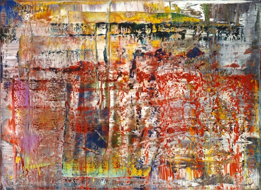
Gerhard Richer, Abstract Painting (724-4) (1990)
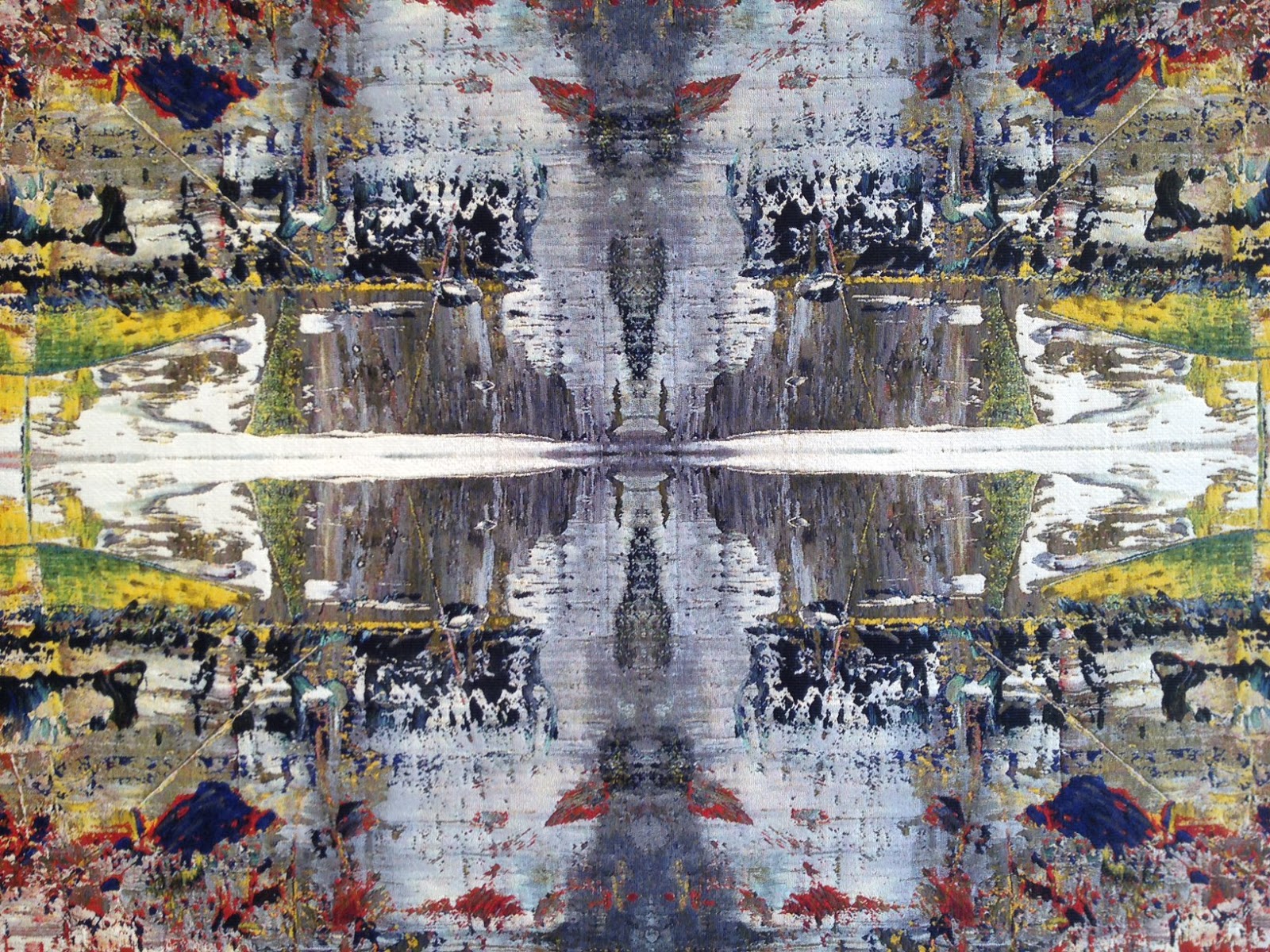
Woven on a mechanical jacquard loom, each tapestry represents a Rohrschach-like four-time multiplication of one quadrant of the original image. Dense and rich, they appear at once medieval and futuristic, tribal and Baroque, with varying texture, thick and thin, and colors that range from murky to brilliantly clear.
While my friend and I stood riveted for at least 20 minutes, a couple with a car and driver waiting outside, entered the otherwise empty storefront gallery, walked up to one tapestry, said “Wow!” and walked out.
Although photos cannot possible replicate the experience, here are some attempts (oddly, my iPhone photos have more vibrant color than the official ones):
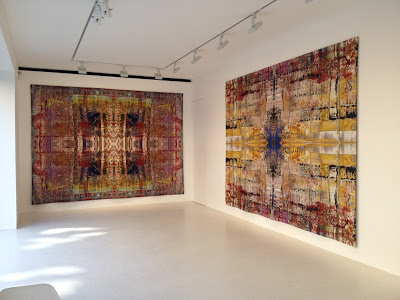 Gerhard Richter, Tapestries, 2009 (Installation view)
 Gerhard Richter, Tapestries, 2009 (Installation view)
 Gerhard Richter, Tapestries (Detail)


Comments (5)
June 18, 2013
I have not stopped blogging, but have simply been concentrating on drawing to the exclusion of everything else. I have no doubt that the desire to vent about something will overtake me again at some point and the floodgates will reopen. Please sign up for email alerts so you'll know when this happens. In the meantime:


Both are ink and graphite on Arches, 12" x 16", as yet untitled.


Both are ink and graphite on Arches, 12" x 16", as yet untitled.
April 20, 2013

Duane Michals, Rigamarole, 2012, Tintype with hand-applied oil paint, 14 x 10 inches (Fred is the name of his partner of 53 years)
In addition to Gerhard Richter and Leonard Cohen, I can add photographer, poet, and painter Duane Michals, now 81, to the list of artists I want to be like in later life who, rich with years of accumulated experience, are now better at their craft than ever and still growing. Duane, whose exhibition of painted photographs is on view at D.C. Moore Gallerythrough April 27th, was one of my earliest influences. In the early 70s, when I was just beginning to paint, I saw his work in books at the Museum of Contemporary Art in Chicago, and was struck by their peculiarity, inventiveness, and tender emotion. These were stories told with staged photographs, later underscored with enigmatic handwritten notes, and even later, painted embellishments. (He was also unafraid to depict a sweet, unabashed homosexuality that was ahead of its time.) I was then so careful and self-conscious about everything I did, it impressed me that he was willing to scrawl on his photographs with such an unaffected hand. Along with the paintings of Joan Snyder, which I discovered around the same time, they inspired me, in 1976, to begin incorporating words into my work. After I came to New York we were involved with the same gallery, Sidney Janis, and collaborated on projects for Art & Antiques (then a truly literary magazine, whose editors encouraged me to invent stories around ideas rather than events), for which Duane photographed Nam June Paik, George Segal, Louise Nevelson, and James Rosenquist.
At his interview and book-signing Thursday at the gallery, Duane admitted that his theme is love, and said that he didn't think he'd captured it yet. I don’t think of myself as particularly emotional, but when I stood to mention the early piece I feel perfectly embodies that sentiment, This photograph is my proof (1974), I surprised myself by getting all choked up. I can’t think of another work of art (outside of Cat Stevens’ song, “Wild World,” which just has too many personal associations) that could affect me like that.
Random notes from the evening:
Poetry is the courage to speak out loud.
Creative people never solve their problem; it's like an itch you can't scratch.
When you get older you should be completely silly.
The old fool does something because it's real and true.
I never learned the limits of photography because I didn't go to photography school and had nothing to unlearn.
Poetry is only a suggestion, a hint, a simulacra.
Facts lie more than poets, and poets lie all the time.
On his own poetry: I was forced to write about what you couldn’t see in the photograph.
You always have to be on the edge of failure, teetering on disaster.
When painters get involved in photography, it's like slumming.
Before the Cubists, there were no Cubists.
There was no precedent for Cubism, and it still reverberates.
I don't like art where I have to participate—participation is the last refuge of the scoundrel.
You can't be too rich, too thin, or have too many idiosyncrasies.
Art is all about freeing yourself, and becoming vulnerable.
Your poetry lies in your failure and vulnerability—otherwise you're not a poet.
Schedule? I can only write when I'm moved to write, paint when I’m moved to paint.
I recommend becoming an old person.
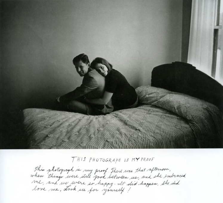
"This photograph is my proof. There was that afternoon when things were still good between us, and she embraced me, and we were so happy. It did happen. She did love me. Look see for yourself!" Duane Michals, 1974.
A description of the exhibition from The New Yorker here.
An unattributed profile from the current permutation of Art & Antiques here.
March 9, 2013
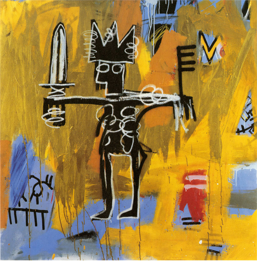
JEAN-MICHEL BASQUIAT
Untitled (Julius Caesar on Gold), 1981
Acrylic and oil paintstick on canvas
50 x 50 inches (127 x 127 cm)
© The Estate of Jean-Michel Basquiat/ADAGP, Paris, ARS, New York 2013
Every year at this time my friend, Terry Perk, comes from England with his students from the University for the Creative Arts and I take them on a gallery tour of Chelsea. Last year the art was so bad I was embarrassed for New York. This year it was a feast, although really, the Basquiats alone would have made the trip worthwhile. Terry says they don’t really know Basquiat in England; there have been no major shows, and the printed images give no indication of their power.
Basquiat had a formidable effect on my life – to the point that in the mid-1980s I stopped painting and withdrew from the gallery I was about to join. I envied the freedom in his work and hated what I saw as orderliness and constraint in mine. I thought, “If I can’t do that, why bother?” My absence from the studio lasted only a few months, but I would not show for another ten years, which was how long it took me to learn to appreciate what was, if uncomfortably, indelibly mine. My method was to make paintings so personal that no one would be interested in exhibiting them. Proof of this is that my first painting from that time, All the Numbers in My Head includes my Social Security number and my AmEx number. I had used writing in my paintings since 1976, but often it was obscured. Now, since I was sure no one was going to see them, I could be more revealing. Eventually they turned into paintings derived from my journals that were ultimately shown at the same gallery I'd been talking to ten years before – although that was pure coincidence since, in the interim, the gallery had a complete change of personnel. Seeing the Basquiats today, those spooky Boettis down the street—preceded by the work of Suzan Frecon and the late Alan Uglow, artists with whom I’ve had connections in the past—is almost too much to process. All of those exhibitions I’ve now been to several times, each visit more satisfying than the next, as well as the transfixing video by Ragnar Kjartansson at Luhring Augustine, with whom my relationship is, at least as yet, uncomplicated.
Basquiat had a formidable effect on my life – to the point that in the mid-1980s I stopped painting and withdrew from the gallery I was about to join. I envied the freedom in his work and hated what I saw as orderliness and constraint in mine. I thought, “If I can’t do that, why bother?” My absence from the studio lasted only a few months, but I would not show for another ten years, which was how long it took me to learn to appreciate what was, if uncomfortably, indelibly mine. My method was to make paintings so personal that no one would be interested in exhibiting them. Proof of this is that my first painting from that time, All the Numbers in My Head includes my Social Security number and my AmEx number. I had used writing in my paintings since 1976, but often it was obscured. Now, since I was sure no one was going to see them, I could be more revealing. Eventually they turned into paintings derived from my journals that were ultimately shown at the same gallery I'd been talking to ten years before – although that was pure coincidence since, in the interim, the gallery had a complete change of personnel. Seeing the Basquiats today, those spooky Boettis down the street—preceded by the work of Suzan Frecon and the late Alan Uglow, artists with whom I’ve had connections in the past—is almost too much to process. All of those exhibitions I’ve now been to several times, each visit more satisfying than the next, as well as the transfixing video by Ragnar Kjartansson at Luhring Augustine, with whom my relationship is, at least as yet, uncomplicated.

Carol Diehl, January, 1997
Oil on canvas, 36" x 36"
Oil on canvas, 36" x 36"
To see:
John Byam / Edlin / 134 Tenth Ave. / thru 3/16
Alan Uglow organized by Bob Nickas / Zwirner / 519 W 19 / thru 3/23
Suzan Frecon / Zwirner / 525 W 19 /
Matthew Weinstein; Elger Esser / Sonnabend / 536 W 22 /
Alighiero Boetti / Gladstone / 515 W 24 /
Ragnar Kjartansson / Luhring Augustine / 531 W 24 / thru 3/18
Andrew Masullo / Boone / 541 W 24 / thru 4/27
Jean-Michel Basquiat / Gagosian / 555 W 24 / thru 4/6
Thomas Nozkowski / Pace / 508 W 25 / thru 3/23
Thomas Nozkowski (drawings) / Pace / 511 W 25
Anthony McCall; James White / Kelly / 475 Tenth Avenue @ 36
March 2, 2013
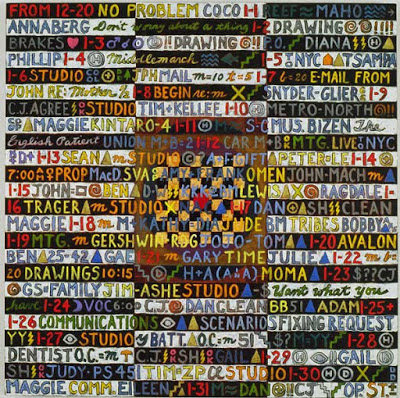
The Alighiero e Boetti exhibition is at Gladstone Gallery until March 23rd, and I have been twice. My life has been full of so many unexplainable synchronistic events that I don’t know why I should be surprised when another crops up, but my relationship to this artist is one of the spookiest. As I wrote previously, I didn’t know Boetti’s work until my dealer at the time, Frank del Deo of Hirshl & Adler, pointed out that some of my paintings were nearly identical to his. This was in 1995; Boetti died in 1994. Of course I looked up his work, and—yikes!—it was like looking at myself. The configuration, the colors, the stylized letters were the same—the only difference was that the Boettis were embroidered and mine were painted. Okay, it could just be those few paintings, but the more I learned about Boetti, the more similarities I found. At the recent MoMA retrospective, for instance, I discovered that he had employed the same way of writing script over script to obscure it that I had, and that he made works with round Avery press-on labels – which I have drawers full. The physical proportion of all of our work is nearly the same. Even the pieces I didn’t do anything like feel familiar, like something I could have done had I followed the thread. This time at Gladstone I found walls full of small pieces that echo a moment in my life when I made small square gridded paintings with friends’ names as gifts….every time I see a piece of his, it’s a shock, like unexpectedly catching a glimpse of myself in a mirror. And what does it all mean? Absolutely nothing. That’s the weirdest part.

Carol Diehl, Journal of a Year, 1995, oil on canvas, one panel of four, each 80" x 48"

OGGI VENTICINQUESIMO GIORNO OTTAVO MESE DELL ANNO MILLE NOVE 100 OTTANTOTTO ALL AMATO PANTHEON INCONTRI E SCONTRI (1988), embroidery on fabric; 40 1/2 x 43 1/2 inches (102.9 x 110.5 cm). Courtesy Gladstone Gallery.
October 1, 2012
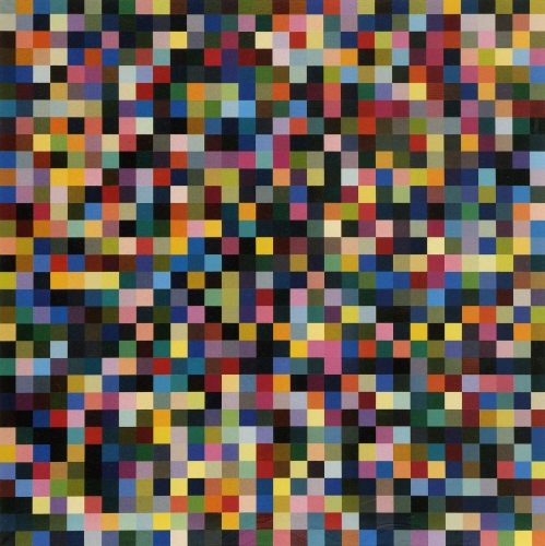
Gerhard Richter, 1024 Colours (1974), enamel on canvas, 96 cm x 96 cm Catalogue Raisonné: 356-1
Karen Rosenberg in her review:
What’s important to know here is that it [Gerhard Richter’s process of digitally deconstructing an image one of his scraped paintings] eventually produces a field of thin colored bands, which Richter then prints, slices, and rearranges manually (as you might shuffle cards) and re-photographs.
NOT so. The first part of the process, the digital deconstruction, might be random (although not entirely, as he is working with an image he created after all, and has also devised the system), but the last part is not. It has been documented that Richter very carefully composed these pieces, saying that otherwise they’d look like wallpaper.
Critics—even when they get their facts right – often do not understand how “chance” (Richter commentator Benjamin Buchloh’s word, when he’s not saying “aleatory”) plays into the making of a work of art, and they make much more of it than artists do. When you read Buchloh, it’s almost as if he interprets this aspect of Richter’s work as indicating that Richter doesn’t care, is not emotionally involved in the outcome and has no formal concerns – when the opposite is the case.
Artists, however, know that “chance,” “accidental,” and even “aleatory” events are an essential part of their process, and consciously or unconsciously build in opportunities for them to happen. If we didn’t, if we could control everything to the point that we knew exactly how it would turn out, there would be no point in doing it; why undertake the experiment if you know from the outset what will happen? It often seems as if critics don’t understand that ours is a process of investigation that involves more than the simple making of things. That’s why I prefer the word “random” over Buchloh’s “chance” (“random” is about eliminating definite aim, while “chance” sounds like dumb luck) – but even more apt would be “unexpected.” We make art because it keeps us in a constant state of surprise—for better or worse. When we use intuition instead of logic, when we allow for the unexpected, trust the unexpected, it becomes a collaboration with unseen forces. I could be crucified in the art world for saying this, but it often feels like prayer.
August 13, 2012
A few days ago I was cranky and didn’t know why. Then, during an impromptu Skype studio visit with Terry in England, he observed that the structure in my paintings is fading into the background and the gesture is becoming dominant. How scary is that? Very scary, it turns out. I realize that I always trusted the structure to carry the “meaning” in my intentionally “meaningless” work (are you still with me?) and the gesture was the lively little cheerleading team that gave it edge and life. Thirty years pass this way—happily, I might add—until I wake up to find that the gesture is parading about as the main character and, to make it worse, I’m all too aware that “gesture” is simply a euphemism for “scribbles.” Now I happen to love my scribbles; I think they’re some of the best scribbles out there. But they’re scribbles. Is it possible that anyone else could love them as much as I do?
About the same time I run into Molly Howitt in the parking lot at the Co-op. Molly was a ceramics student when I was teaching painting at Bennington, and I made it a point to collect as much of her output as possible—paying her for some, but not being above poking around in the reject pile outside the studio for others. I remember once fighting with another faculty member over who was going to buy the bowl we were supposed to be critiquing—I won, and still love it. Molly has been doing a million other things since, all worthy, but no ceramics. When I bring this up for the 100th time (I can be annoying), Molly says, “I loved the process, it’s just that I wasn’t doing anything special.”
And true; her work was very simple. However it had an elegance that distinguished it from all other handmade pots, most of which look, to me (apologies, ceramicists out there!) excruciatingly alike. Molly brightened when I told her this; maybe she’ll actually do it.
Then I went home to my scribbles, appreciating for the first time, how much courage it must have taken to be Cy Twombly.

Carol Diehl, Althaea, 2012, ink & pencil on panel, 12" x 14"
May 14, 2012
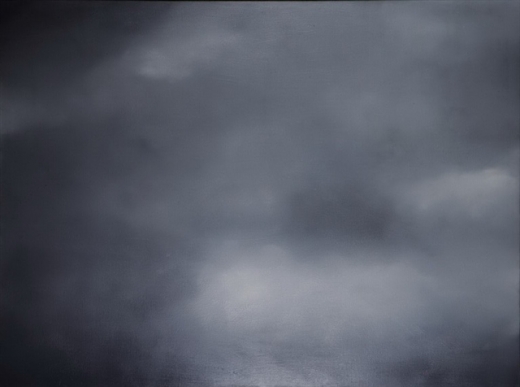
· Gerhard Richter, Clouds (Grey, 1969), oil on canvas, 150 cm x 200 cm.
I was starting to write a post about my trip to Chicago, but got distracted when I emailed to a friend that I was going to Paris soon to see the Gerhard Richter retrospective at the Beaubourg and drawing show at the Louvre, and she sent me this, a rant about the commodification of his work by Reuters' Felix Salmon.
Richter’s paintings being commodities has nothing to do with Richter, the artist. Clearly this was not the artist’s decision, nor his intention. Contrary to what Salmon has to say, a majority of us in the “making” part of the art world think Richter is very important, someone with a tremendous influence (the fact that the film, “Gerhard Richter Painting” is still running, after two months, at Film Forum, is testimony to that). I, for one, am grateful to have a model, someone to look up to, who's still producing great work at 80 or whatever.
But here’s the thing: Picasso, de Kooning, and Warhol aren’t just good artists, they’re important artists — among the most important of the 20th Century. They permanently changed the way we look at and think about art: what it is, what it can do, what it should look like. Richter’s no slouch on that front, but he’s not in their league, and never will be.
So how does a financial writer get to decide which artists are “important” and which aren’t? I don’t see Reuters asking me for financial analysis.
The writer’s assumptions are faulty on several counts. Just because Picasso and Warhol took longer to be recognized in the 20th century doesn't mean that's what's necessary to be an "important" artist in the 21st century, when communication is so much faster, when the cultural world is so much bigger and more savvy, and when (as a result of Picasso, Warhol, and Duchamp) “difficult” is easy, breaking rules (or looking as if you’re breaking rules) is the order of the day, and “meaningful” is much harder to come by. Given his times, which have been characterized by cynicism (think Jeff Koons, Richard Prince, Damien Hirst) and any sincere attempt at beauty has been taboo, Richter is actually radical. In this climate, to be unabashedly conscious of painting's possible emotional content, to paint landscapes, family portraits, candles—anything that, in other hands, would be seen as sentimental—takes a lot of courage; not to speak of working in several different styles when most artists and galleries saw, and still see, developing a single "signature" as the only route to recognition (think BriceMarden).
Further, his dealer is not Gagosian, who might automatically be assumed to be promoting commodification but Richter, since the beginning, has been represented by Marian Goodman, who has always demonstrated enormous restraint, and for whom the art always comes first.
So Richter makes a lot of paintings; let us not forget that it’s his passion, and he can afford to indulge it. The writer’s own examples, Picasso and Warhol, proved that it’s possible to be both prolific and “important.”
It's easy to bash success. But sometimes there's a reason for that success.
So what if collectors are having a feeding frenzy. I think/hope/pray that we're coming into a time when the spirituality in art (and, dare I say, b-b-b-beauty?) will again be celebrated, and Richter is leading the way.