Richard Serra
Art Vent Letting the Fresh Air In
August 26, 2013
Every hue throughout your work is altered by every touch you add in other places.
—John Ruskin
The work promotes a state of contemplation in a communal viewing space, rekindling the museum’s founding identity as a “temple of spirit”—Guggenheim Museum press release for James Turrell’s Aten Reign, on view through September 25, 2013.
For the past several weeks I’ve been trying to make sense of my profound underwhelm with James Turrell’s otherwise much-touted light extravaganza at the Guggenheim. I love the Guggenheim; the architecture makes any reason to go there a special event, and now one of my most-admired artists has filled the atrium with a giant hollow cone of light and color which, ovoid and tiered like a wedding cake, floats over a seating area like a flying saucer. Gently diffused by the cone’s scrim-like fabric, LED lights gradually shift from one gradated color to another, while muted natural light filters in through the skylight. What’s not to like?
It should be right up my alley. Turrell’s permanent installation at MoMA/PS1, Meeting (1986) is at the top of my ten best list. In addition, I’ve spent a good part of my professional life writing about Robert Irwinand Olafur Eliasson, who work with perception and light in similar ways. I also have a special affinity with Turrell because I, too, come from Quaker stock and have been a practicing Quaker. Meditation and contemplation are important parts of my life.
However, seated in the atrium at the press preview, instead of going into rapture, I began thinking about Eliasson’s circular 360°Room(s) for all Colors of similarly changing hues. There visitors are highlighted participants, lit like fashion models against a seamless background, where here they appeared to have little relationship with the piece that hovered above them. I also thought about how, in those Eliasson pieces, you can walk right up to the “wall,” which seems to have no substance but that of color, and practically put your nose in it—while the entire experience Turrell has created at the Guggenheim is “up there.” Not significantly related to the scale of my body, it felt separate from me, which meant I didn’t have the desired heightened awareness of my place in it—I was not, to employ the overused phrase, “seeing myself seeing”—any more than I would at a fireworks display. In every work of art the “here” and “there” are important aspects; to be fully satisfying, I want even a painting to tell me something up close as well as from a distance. In an installation, it’s even more important, because if my situation as a visitor isn’t fully developed, I don’t feel a connection with whatever else is going on.

Olafur Eliasson. 360° room for all colours. 2002. Stainless steel, projection foil, fluorescent lights, wood, and control unit, 126 x 321 x 321" (320 x 815.3 x 815.3 cm). Private collection. Installation view at Musée d'Art moderne de la Ville de Paris. Courtesy Tanya Bonakdar Gallery, New York. © 2008 Olafur Eliasson
The most important aspect, however, of “seeing ourselves seeing” is that our perception is challenged to the point that we no longer trust our normal visual clues. This produces a particular state of self-consciousness that merges with the work—and at this, Turrell has been a master. In his Skyscapes, like the one at PS1, the sky becomes a “thing” you feel you could almost touch, with the result that you find yourself simultaneously questioning it and yourself. And looking at one of his early, simple corner light projections, your brain processes it as a cube with actual mass, even though you know it isn’t. Nothing like that happens at the Guggenheim; while it’s beautiful, even stunning, there’s no mystery. What you see is what you get—an indication that the line between art and lighting design (which has become extremely sophisticated through the influence of artists) is now very, very thin.

James Turrell, Meeting(1986) MoMA/PS1. Photo: Carol Diehl, 2011
“He’s an orchestrator of experience,” Chuck Close has said of Turrell—but what makes up that experience? Where does it start and stop? Does it begin when you hear about it from a friend, or read a review? Those are things the artist can’t control, but he can influence what happens from the minute you walk through the door.
And what’s that like? My friend, David, a hospital administrator who made the mistake of visiting the Guggenheim with his out-of-town family on a weekend, described it as…“Horrible. Like Disneyland. There were 4-5 lines squeezed into the walled-off lobby, and you’re trying to get in line and bumping into everyone…and once you get your ticket and come into the atrium you’re trying to look up but can’t because there are so many people. It was pretty, but hardly transcendent. The architecture was all covered up and you could have been anywhere. And then, still bumping into people, you walked up the walled-off ramp, which felt like a missed [artistic] opportunity, to stand in more lines. Not that we were looking to be entertained, but we were looking for $20 worth of something.”
Another friend said the guards were ordering people around, telling them to get off the floor if they tried to lay on it….”It’s not their fault,” he said, “They were only doing their job, but it could have been managed better.”
So how much of that has to do with Turrell? I think it all does.
Much to the annoyance of painting students when I refuse to overlook a warped stretcher (the perpetual question being, “Is this intentional?”), I have always contended that everything that falls into my experience is part of the piece—a view that has fueled my no-doubt tedious bloggy diatribes against artists’ statements, wall text, audio tours, black-out curtains, headphones, etc.
I was irritated when, a few years ago, I found that entrance to a Turrell installation, required shedding my shoes and donning floppy Tyvek protective booties. While surely an over-reaction on the part of one who’s invested too much in her fashion statement, I interpreted this as a power play on the part of the artist (“Really? Part of your piece is to make me look ridiculous?”).
So yes, in my book, the queues, crowd control, and the need for crowd control are all part of it. This is, after all, the same museum that, in 2010, featured relational aesthetics guru, Tino Seghal, whose piece involved engaging visitors in conversation. After that and many similar, such as Martha Rosler’s garage sale and Marina Abramović’s The Artist is Present, both recently at MoMA, it would be arbitrary to insist that personal interactions are significant in one circumstance, but not in another.
Eliasson (who was largely inspired by Robert Irwin, also my biggest influence, and now both have shaped my thinking) was aware of this responsibility on the part of the artist back in 2003, when he configured his monumental weather project at the Tate Modern. Approaching the institution as a whole, part of his preparation involved talking to members of each of the museum’s departments to discuss how their roles would impact his project.

Olafur Eliasson, weather project (2003), Tate Modern
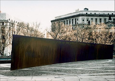
Eliasson also configured something that could handle the crowds it brought—which raises a related question: what is the artist’s accountability to the social situation his work is creating and/or occupying? For defenders of Richard Serra’s threatening Tilted Arc, which after much controversy, was ultimately removed from a busy office plaza, the answer was “None.” But much has gone on since 1989, with artists now more aware of, and willing to embrace, the public nature of their work. If relational aesthetics has had a positive impact, it has been to highlight the artist’s role in configuring the entire art experience.
All of this casts doubt on the decision to turn Frank Lloyd Wright’s soaring masterpiece into a confined area that requires limited entrance—and attempt to create a relatively intimate space in a public institution whose most basic function is to accommodate large numbers of people. Another power play perhaps?
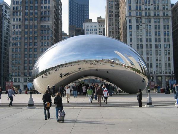
I like to think of “generosity” in terms of public sculpture/installation, as a measure of the number of ways a work may fulfill the artist’s intention to successfully affect his audience. For example, few works are more “generous” than Anish Kapoor’s Cloud Gate in Chicago’s Millennium Park. Installed in 2006 and nicknamed “The Bean” for its shape, this giant organic structure of highly polished stainless steel is engaging day and night, from afar, up close, and even underneath, involves light, reflection, and movement, and is as affective in the presence of crowds as it would be in solitude.
Anish Kapoor, Cloud Gate (2003-6), video: Carol Diehl (2012).
This is not to say that art has to be popular or even pleasing, but that it fulfills its purpose on every level. Therefore, if the intention of a piece was about the frustration of not being able to see it, say, then the question of its success would be, was everyone sufficiently frustrated?
Frustration and contemplation, however, do not go together.
Frustration and contemplation, however, do not go together.
Meanwhile, the frustration at the Guggenheim continues even after one leaves the atrium and attempts to see Turrell’s earlier works by joining the crowds to ascend the museum’s curving ramps, now claustrophobic tunnels with “walls” of opaque white fabric that block any view of the atrium. As students know, one of the first questions one asks when evaluating any sculpture is, does it perform equally well from all sides, or does it have a “dead zone?” This is something sculptors like Mark de Suvero and Richard Serra have obviously given a lot of thought to—as did the ancient Greeks. And especially now that sculpture engages the scale and dynamics of architecture, just as with personal interactions, it seems arbitrary to insist that we shouldn’t take the outside of Turrell’s cone into consideration as an integral part of the piece—it was, as my friend, David, put it, a “missed opportunity.”


Photo by 

Jenny Holzer,

ROBERT IRWIN: SCRIM VEIL—BLACK RECTANGLE—NATURAL LIGHT, WHITNEY MUSEUM OF AMERICAN ART, NEW YORK (1977)
JUNE 27–SEPT 1, 2013 Photo: Carol Diehl 2013PART II Robert Irwin on "Scrim Veil-Black Rectangle-Natural Light (1977)" recently at the Whitney
Further reading:
Roberta Smith on Turrell "New Light Fixture for Famous Rotunda" and Irwin "Ineffable Emptiness: From Dawn to Dusk"
Gabrielle Selz "Considering Perception: Robert Irwin and James Turrell": a look at their shared history.
Lee Rosenbaum: "Turrell's Skyspace Obscures the Sky"
Blake Gopnik: "Has the Sage Turrell Sold Out?"
Comments (5)
November 3, 2009
 Anne Truit, First, 1961. Latex on wood, 44 1/4 x 17 3/4 x 7 in. The Baltimore Museum of Art: Gift of the artist, Washington, DC. Artwork © Estate of Anne Truitt/The Bridgeman Art Library
Doing research on Anne Truitt (1921-2004) and her current Hirshhorn Museum survey, I’m reading the catalogue essay where curator Kristen Hileman writes:
Not wanting to anchor the work in a linear narrative, or imply that her sculpture in any way ‘illustrated’ a particular event, Truitt herself was reticent to make fully explicit the connections she nevertheless acknowledged between her life and art. Instead she emphasized the importance of the transformation from the specific to the universal in her process.
After stating clearly what the artist would not have wanted, Hileman turns around to do exactly that:
The elucidation of some of the events, places, people, literary references, and philosophies that appear to constitute fragments of the iconography Truitt perceived behind her ultimately irreducible works, however, provides another lens through which to consider Truitt’s unique and highly expressive deployment of the objective language of color and geometry.
Hileman then, throughout the essay, continues to interpret Truitt's work through biography as in:
The two works further appear to convey a sense of the “powerful” and “looming” qualities the artist associated with Asheville’s mountains….” and “Truitt’s childhood encounters in and around fences lend a psychological dimension to the boundary depicted in First…
Inanimate sculptures that do not include a video monitor and on which nothing is written cannot “convey” or “appear to convey” anything, and any “psychological dimension” that can be associated with an art work is elicited by the configuration of the work itself, not by specific pre-knowledge of the artist’s history.
Granted Truitt, having published her memoirs in three volumes, invites this sort of exercise more than most, however the dependence of critics and curators on information that is not intrinsic to the work is epidemic—and, because the backstory is so often used to justify or rationalize what's on view, I will even go so far as to say that it’s responsible in large part for the ridiculous amount of bad art we see out there (an artist friend wanted to blame it on the artists, but they’re not the ones making the selections, and further, this kind of thing only encourages them to think that’s what art is).
Interpreters of art seem unable to deal with the object itself and instead rely on externals, often having to do with the artist’s “intention” or political bent or, when dealing with artists like Luc Tuymans or Josh Smith, how their work represents some kind of reaction to the history of painting. But it’s really simple. The work is the work, no matter who did it, when s/he did it, or why s/he did it. Biographical information, such as the fact that Richard Serra had day jobs in steel mills is worth noting if trying to determine how he arrived at his format, but the work itself, that big thing made of metal, is something else entirely. What does it convey or express? Nothing. What are its “psychological dimensions?” None.
While it seems that the function of curators and critics should be to open up the discourse to many interpretive possibilities, this conflation of intent and biography with the work allows for a single reading, too narrow a lens through which to view any artist, especially one as evocative as Truitt.
While in Washington on Friday to see the exhibition and catch James Meyer’s excellent gallery talk (Meyer being the perfect example of an art historian who knows what’s important and what isn’t), I also had lunch with Tyler Green of Modern Art Notes, who said he thought that with the advent of photography, writers about art were not so inclined to engage in elaborate description.
If so, this could explain a lot, because for me, it’s through being forced to describe something that I learn what it is and what I really think about it. In fact this is why I write about art at all, because I wouldn’t engage in such a detailed exercise on my own. It’s how I learn, and it’s how I teach students to write about art. In fact I think everyone studying any aspect of the arts should be required to take art writing, not so they can better write their theses or that noxious item we call the artist’s statement, but because through writing description you learn to observe what’s outside—and inside—you. And no matter what the endeavor—be it art, bricklaying, dentistry or cooking—observation is everything.
February 19, 2008

Richard Serra from a video interview at MoMA on NewArtTV: “There isn’t any big paradigm shift. What happens is work comes out of work, and if the paradigm shift occurs, it’s because a problem leads to a different solution that you could not have anticipated.” Serra explains that he began his studio practice, not by plotting out specific pieces, but by asking himself questions such as: “What does it mean to build something that has a fixed joint?” “What does it mean to balance something?…to counterbalance something?” When asked by a journalist how he sees his future work at this point in his career, Serra repeats, “Work comes out of work. I don’t anticipate work to come….I just want to work.”
Ah, more support for my contention that art springs not from the “idea” or “concept” (see Back from VSC 2/1 and Talking the talk or…2/3 and the discussion in the Comments) that so many students are encouraged to have in place before they begin, but from the work itself and the questions it raises. The danger is that a “concept” can easily become a closed circuit—with the work remaining simply an illustration of that concept—whereas a “question” is an open one. This is not to say that there’s no place for analysis, but it’s a different activity, not to be mistaken for the art.
At its best, art produces responses that can’t be quantified—that are sensed rather than understood. So if we’re after something that can’t be understood, or an answer we didn’t anticipate, intellect won’t help us, only intuition—and the work, our process, is the stage we set to allow intuition to unfold.
Similarly, when talking or writing about their work, artists often give so much information, or information extraneous to the experience, that it interferes with the reaction to it and cuts off the possibility of responses they may not have anticipated—you can torture yourself with examples of this also on NewArtTV such as Diana Thater saying, “My work is about, for the most part, learning and knowing through observation that observation is knowledge or intense observation produces knowledge….” Does that make you crazy to see her work or what?
This is why, when I’m king, along with abolishing the artists’ statement, I’ll also regulate wall text, which I’ve noticed museum visitors spend more time with than the work itself. It’s not that information about an exhibition shouldn’t exist, but best relegated to a special room near the exit, one to which visitors can only gain entrance after proving that they’ve actually looked at what’s on display by taking a short quiz.
June 21, 2007

I think a lot about art and its context, especially after the Serra show, where the surroundings were too severe, and then visiting Wave Hill, where it’s a challenge for art to compete with the gorgeousness of the place. Actually, the grounds are art and should be seen as such. The design is the concept of a singular man—Scott, who knows everything, told me—the recently retired Marco Polo Stufano. One wonderful thing is the unexpected juxtaposition of vegetables—fabulous heads of shiny purple lettuce, corn even—with more traditional ornamental plants. However there are certainly artists who would be up to it, either by contrast or by fitting in, who could make even more of that site, or the rooms of those elegant buildings--Robert Irwin being one of them, of course, and Spencer Finch if he were trying (while I love his Mass acheter viagra MoCA show, his offering at Wave Hill was lame at best; perhaps he thought no one would see it).
My first experience of the inspired confluence of art and architecture was in the early eighties at a Pop Art exhibition in Venice’s Palazzo Grassi, where a giant Warhol Mao, at least 20-feet-tall, was installed in an impossibly ornate room that I remember as being taller than it was wide and ringed with several stories of balconies. Ever since, my impatience with the white box has been growing. I think it's one of those art world assumptions—having to do with the notion that art is sacrosanct and should not be interfered with—that took hold and now, never questioned, is self-perpetuating. (Along with another of my bugaboos, the idea that items in a retrospective need necessarily be installed in chronological order.)
I know that, as an artist, I’m not supposed to like Frank Lloyd Wright’s Guggenheim, but I do, and not just because I welcome any opportunity to walk uphill. It always feels special to go there, an event, and more than any other museum, I have distinct memories of not only the works I’ve seen there, but where and how they were placed, how I felt coming upon them, and how they looked from a distance, across the atrium. What other museum offers you a view of something from eighty (I’m guessing here) feet away? In the Guggenheim you view works one at a time, whereas in the white box you must make choices about what to do with your attention, so whenever you’re looking at something you must always be conscious of what you’re not looking at as well.
Thus my irritation with the Serra installation at MoMA (the white box plus track lighting—ugh!) and don’t even get me started on the Brice Marden show. All right, get me started. I like Marden’s paintings. I’ve come upon a single Marden somewhere and been blown away, and I remember seeing a perfectly exquisite Marden show at the Serpentine Gallery in London. But I wouldn’t want to be Marden. To have to get up in the morning and face those canvases day after day? (As a rock musician friend said, after I played him Philip Glass, “It’s a dirty job, but somebody has to do it.”). And when you combine repetitive paintings with a repetitive installation you come up with something you want to walk through very fast. Curators who insist on mounting the works in chronological order (and I’m not saying it might not work in some cases—as Robert Irwin says, “Sometimes the best solution is the cannon on the green”) are making a statement that values development over aesthetic experience. In Marden's MoMA exhibition, I would have liked to see the ribbon paintings interspersed with the monochromatic panel paintings; this would have created a textured environment where each piece could be seen on its own merits, without the distraction of an almost identical one next to it. To find out about Marden's process of development, there could have been a handout and/or wall text at the end, illustrated with small reproductions, that listed the order in which they were created.
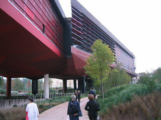
An example of a thoughtfully installed show that doesn’t lean heavily on chronology is the Louise Nevelson retrospective at the Jewish Museum (on view into September). And according to Art Daily, Michael Govan, formerly of the Dia Foundation and now the director at the Los Angeles County Museum, is intending to use artists—including James Turrell and Jorge Pardo—as designers. What if one artist were to design the exhibition space for another? How cool would that be? I’d let Robert Irwin design a space for my paintings! Rem Koolhaas designed an exhibition for Terry Winters in SoHo once upon a time, which could have been more successful (except I do remember it clearly, which is something), but given how fabulous his Student Center is at the Illinois Institute of Technology (below)—when you are in Chicago, don’t miss it!—if he volunteered I’d let him have a go as well.
My first experience of the inspired confluence of art and architecture was in the early eighties at a Pop Art exhibition in Venice’s Palazzo Grassi, where a giant Warhol Mao, at least 20-feet-tall, was installed in an impossibly ornate room that I remember as being taller than it was wide and ringed with several stories of balconies. Ever since, my impatience with the white box has been growing. I think it's one of those art world assumptions—having to do with the notion that art is sacrosanct and should not be interfered with—that took hold and now, never questioned, is self-perpetuating. (Along with another of my bugaboos, the idea that items in a retrospective need necessarily be installed in chronological order.)
I know that, as an artist, I’m not supposed to like Frank Lloyd Wright’s Guggenheim, but I do, and not just because I welcome any opportunity to walk uphill. It always feels special to go there, an event, and more than any other museum, I have distinct memories of not only the works I’ve seen there, but where and how they were placed, how I felt coming upon them, and how they looked from a distance, across the atrium. What other museum offers you a view of something from eighty (I’m guessing here) feet away? In the Guggenheim you view works one at a time, whereas in the white box you must make choices about what to do with your attention, so whenever you’re looking at something you must always be conscious of what you’re not looking at as well.
Thus my irritation with the Serra installation at MoMA (the white box plus track lighting—ugh!) and don’t even get me started on the Brice Marden show. All right, get me started. I like Marden’s paintings. I’ve come upon a single Marden somewhere and been blown away, and I remember seeing a perfectly exquisite Marden show at the Serpentine Gallery in London. But I wouldn’t want to be Marden. To have to get up in the morning and face those canvases day after day? (As a rock musician friend said, after I played him Philip Glass, “It’s a dirty job, but somebody has to do it.”). And when you combine repetitive paintings with a repetitive installation you come up with something you want to walk through very fast. Curators who insist on mounting the works in chronological order (and I’m not saying it might not work in some cases—as Robert Irwin says, “Sometimes the best solution is the cannon on the green”) are making a statement that values development over aesthetic experience. In Marden's MoMA exhibition, I would have liked to see the ribbon paintings interspersed with the monochromatic panel paintings; this would have created a textured environment where each piece could be seen on its own merits, without the distraction of an almost identical one next to it. To find out about Marden's process of development, there could have been a handout and/or wall text at the end, illustrated with small reproductions, that listed the order in which they were created.
An example of a thoughtfully installed show that doesn’t lean heavily on chronology is the Louise Nevelson retrospective at the Jewish Museum (on view into September). And according to Art Daily, Michael Govan, formerly of the Dia Foundation and now the director at the Los Angeles County Museum, is intending to use artists—including James Turrell and Jorge Pardo—as designers. What if one artist were to design the exhibition space for another? How cool would that be? I’d let Robert Irwin design a space for my paintings! Rem Koolhaas designed an exhibition for Terry Winters in SoHo once upon a time, which could have been more successful (except I do remember it clearly, which is something), but given how fabulous his Student Center is at the Illinois Institute of Technology (below)—when you are in Chicago, don’t miss it!—if he volunteered I’d let him have a go as well.
Other people thinking creatively out there include architect Jean Nouvel who, in his Paris Musee du Quai Branly for indigenous art, has completely rethought the museum experience. It’s a place where the architecture is very evident, but serves only make the art look better. When I was there in October they wouldn't allow photography inside, but to whet your interest here's an exterior view:
Not all artists want a pristine environment for their work. When I was talking about this with Judy Fox, she told me she fanaticizes about having her life-size sculpture of Snow White in her glass coffin being purchased by collectors who will use it as a coffee table “with the children’s book,” she says, “as the coffee table book on top.”
June 18, 2007
Obviously I’ve been thinking too much. Anyway, Terry alerted me to a podcast lecture by Malcolm Gladwell (under New Yorker Conference in iTunes podcasts), where Gladwell distinguishes between two types of “geniuses.” The first “old-fashioned” kind isolates himself (he’s comparing two specific men) and works on something until he has that “Eureka!” moment, while the new style “genius” plugs away on a problem by drawing on the work of many other thinkers like himself. In discussing both cases, Gladwell falls back on the theory that it takes 10,000 hours (or three hours a day for ten years) to become a “master” of something, anything, and talks about the value of persistence and observation.
I wonder what happens when we apply these templates to the making of art and so-called “genius” artists? In his book, Old Masters and Young Geniuses: The Two Life Cycles of Artistic Creativity, David W. Galenson (who I found out about through an article by Gladwell) makes a distinction between those artists who have the big flash of innovation early in life, and those whose best work comes after working for many years. Rauschenberg would be an example of the former, while Serra might embody the latter. Matisse, for sure.
I feel our culture, to its detriment, cultivates the myth of the individual genius and overlooks the true roots of art and innovation. Artists such as Picasso and Pollock didn’t work in a vacuum, but were very involved with others who were working on and sharing similar ideas. Pollock was even married to one.
It was Emerson’s belief that the seeds of genius are in all of us, and it’s a matter of being brave enough to speak our truth. In his essay, Self-Reliance, he says:
To believe your own thought, to believe that what is true for you in your private heart is true for all men—that is genius. Speak your latent conviction and it shall be universal sense; for always the inmost becomes the outmost--and our first thought is rendered back to us by the trumpets of the Last Judgment. Familiar as the voice of the mind is to each, the highest merit we ascribe to Moses, Plato, and Milton is that they set at naught books and traditions, and spoke not what men, but what they thought. A man should learn to detect and watch that gleam of light which flashes across his mind from within, more than the luster of the firmament of bards and sages. Yet he dismisses without notice his thought, because it is his. In every work of genius we recognize our own rejected thoughts; they come back to us with a certain alienated majesty. Great works of art have no more affecting lesson than this. They teach us to abide by our spontaneous impression with good-humored inflexibility then most when the whole cry of voices is on the other side. Else tomorrow a stranger will say with masterly good sense precisely what we have thought and felt all the time, and we shall be forced to take with shame our own opinion from another.
I give more credit to persistence and passion—and the support of a milieu—than innate talent. One thing I’ve observed in teaching, is that sometimes those who show the most natural ability early on later fall by the wayside. I think this is because they become accustomed to easy success so when the going gets tough, which it often does if they’re going to make the leap into something great, they don’t have the psychological “muscles” it takes to push it to the next level. However, for those of us for whom it never came easy, each step just looks like the one before it.
And then there was the graduate student who said to me during a critique, “It probably would have been better if I’d worked on it longer.”
May 30, 2007

Tuesday was the press preview for the Richard Serra show at MoMA (up through September 10). First, of course, I had to go to the MoMA Design Store, but they were out of the key chains I wanted. Anyway, I got to the museum in time to witness Serra being introduced as one of the greatest sculptors of our time, which he undoubtedly is—if not the greatest—and I must grudgingly go along with that assessment.
I used to hate Serra’s work, finding it ego-driven and misanthropic in the extreme. He’d set up four heavy metal plates and lean them against one another so they formed a cube that looked as if it might collapse at any moment; it seemed to be all about very heavy stuff that could possibly fall on you. Then a piece did kill a rigger who was installing it--and that Serra would later make drawings entitled Dead Weight and show them in the same gallery space where that tragedy occurred seemed the height of insensitivity, not to speak of bad taste. In the Tilted Arc controversy in the eighties, I agreed with the government workers who wanted the sculpture removed from the plaza in front of the building in which they worked. Who wants to have lunch in the shadow of a big metal plate that looks if it could fall any minute? And since when does the term “site-specific” refer only the physical aspects of the place and not take into account the wellbeing of the people who use it? Art is important, but not that important.
However just as I believe it shouldn’t make any difference if an artist has Alzheimer’s (see Something to look forward to below), I also don’t think the personality of the artist—whether he’s anti-Semitic like Richard Wagner or just a hard s.o.b. like Serra--has any place in the evaluation of the work. The work is the work. So when Serra began to make pieces that really spoke to me—the Torqued Elipses in the nineties—I had to make myself forget all that other stuff. Where the earlier sculpture underscored what we already know about steel—that it’s heavy, flat, and solid and can kill you—the many-tonned Torqued Elipses work against the material’s innate qualities to become lyrical, pliable, curving, soaring and, like Gehry’s architecture, solidly grounded as much as they are unbalanced and unpredictable. When the Torqued Elipses were shown at the Dia Foundation they were a revelation. And the pieces in the sculpture garden at MoMA are wonderfully sited—the steel plays off the marble garden floor, the foliage, the sky, and the vast cityscape. However Serra’s monsters loose their vitality when they’re incarcerated in the white windowless rectangles of the interior galleries and lit with generic track lighting (really, with a gazillion dollars to play with, can’t MoMA come up with anything better?) so that they ultimately end up looking like so many caged hippos. In an effort to avoid creating a context that wouldn't compete with the sculpture, the museum setting has drained them of all life.
Like the government workers in the Federal Building, they need a place to breathe.