Shepard Fairey
Art Vent Letting the Fresh Air In
December 15, 2011
By now everyone knows that TIME’s Person of the Year for 2011 is “The Protester” and that Shepard Fairey created the cover. Those who’ve followed this blog for a while know that I worked as a consultant for TIME on the covers for over 20 years, and introduced Fairey to TIME in 2007, when he created an image of Putin that ran on the inside (see post here). While the Person of the Year, along with the magazine itself, no longer has much cachet, I’m still glad TIME made a good call (over, say, Kate Middleton for getting married or Steve Jobs for dying) as it represents formal recognition that this is a massive, worldwide movement—unlike the New York Times, which is still waiting for Occupy to go away so no one will notice that they haven’t been covering it.
I admire Shepard Fairey and feel his success is deserved; I have absolutely no patience with the kneejerk reaction that commercial success = sellout (Coldplay remains a favorite, and I’m glad Radiohead left their major label so they, too, don’t have to be a guilty pleasure). However, if I still worked for TIME, I wouldn’t have recommended Fairey for this cover simply because the protests represent the new and unknown, where his now-ubiquitous style is associated with the known, the past, and is simply too sleek and realized (again, nothing wrong with that per se) to represent the nascent, unformed and gritty surge that is this movement. If they’d asked, I would have looked for the street artist who is now what Fairey was in 2007. It's no one I could name off the top of my head. Because a TIME cover has very specific requirements, that would require the research that was once my job. I might, however, start here:
Although it’s had the Internet on fire for weeks and was a headline today in Britain’s Guardian, another event the New York Times (along with the rest of the mainstream media) hasn’t covered is the hasty passing—ironically on 220th anniversary of the Bill of Rights—of the latest iteration of the National Defense Authorization Act, which many feel compromises our most basic American rights to due process. But you can learn about it on the Huffington Post, and if you need a laugh to mitigate the fright, on The Daily Show.
Meanwhile, in the art world, I received a press release today announcing that Gagosian will be showing ALL of Damien Hirst’s dot paintings (they call them “spot” paintings) in ALL of the eleven Gagosian Galleries throughout the world—Paris, Athens, Geneva, Hong Kong, London, Rome and New York. Now there’s an event to stay home for. My opinion as a critic is, if you’ve seen one dot painting, you’ve seen them all. You can quote me.
Banksy's take on Hirst's dot paintings.
Banksy's take on Hirst's dot paintings.
Comments (5)
October 7, 2009
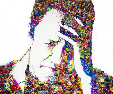 Vik Muniz, Self-Portrait (I Am Too Sad To Tell You after Bas Jan Ader) (Rebus) 2003
If I had my own art magazine, I’d never publish just one review of anything, but gather a number of opinions. Many moons ago, when I worked at Artforum, we published six artists’ takes on (I think it was) a major Matisse exhibition, and it told me so much more than just about Matisse. Last week Mike Glier, Roberto Juarez and I, all painters, went to hear Vik Muniz lecture on his work at Williams College, and the result was an impassioned email exchange. For those not familiar with Muniz’s work, he generally arranges unusual media (sugar, poured chocolate, color chips, thread, wire, garbage) to form an image that he then photographs. Most often these images are already famous in the culture—say, two views of the Mona Lisa, one from peanut butter, the other with jelly, or the famous Hans Namuth photograph of Jackson Pollock rendered in dripping chocolate, or Titian’s “Icarus” made from junk.
Mike Glier:
When Muniz spoke at Williams, he was warm and articulate and his work was ambitious, but I was annoyed by the talk. In fact I was so bothered after this charming talk, I had to pause to think about the sources of the feeling.
On a pan of snow a student, Patrick Hubenthal, drew the Sphinx in ink. It was around 1990 at Williams College and the class, guided by a reading from Roland Barthes’ “Mythologies”, had just completed a discussion of the semiotics of materials. Patrick brought the pan of snow in from the cold, and as we critiqued the Sphinx it disappeared. Patrick also drew a man tenderly bottle feeding a calf, using beef gravy as his medium. Years later, in response to the same assignment another student injected bubble wrap with colored water to make a pixilated version of a Madonna which shown like stained glass when hung in the light. Yet another used her blood to draw a portrait of her mother.
After the Muniz lecture I was irritated that an important career like his has been crafted from an idea that I think of as an introductory design problem. Like the students inspired by Barthes years ago, Muniz showed multiple examples of drawings made from unusual materials like thread and food and garbage. But I don't complain when someone makes art from something as clichéd as charcoal, so perhaps it's best to consider the final product of Muniz rather then the originality of his materials.
But I was also annoyed that student works like those I described above, which were equally interesting to Muniz, are gone and appreciated by so few. But beauty disappears everyday, and often goes unappreciated. In retrospect annoyance wasn't what I was feeling after the lecture; it was a cover for grief, just a little grief over what is saved and what is lost.
With these feelings put to the side, it's easier to look at his body of work and consider individual works, many of which are very good. The "Memory Drawings" are really terrific examples of the power of photography to create collective memory. I also liked the "Sugar" drawings which tied the sweetness of children to the harshness of the lives of their parents who worked in sugar cane production. After these two pieces, I thought much of the work simply clever. But in a few works the symbolic nature of the material/s reacted with the image to make something resonant. The portrait of Sigmund Freud drawn in chocolate, for example, was a winner not only for the masterful splashing gestures, but also for the sensuality of chocolate and its potential as a vehicle for compulsion and its reference to all things anal. But Pollock in dripping chocolate was silly and an example of conceptual art reduced to a visual one-liner. I also liked the colossal copy of Caravaggio’s “Narcissus” traced in a huge scale with junk. This time he brought an image forward from art history but tied it neatly and poignantly to the ennui of modern consumer society. The portraits of Divas derived from the work of other photographers and drawn in diamonds are trashy-stylish, but I just don't find any sustenance in images of fabulous excess. And didn't Andy Warhol do the same thing in the “Diamond Dust” series?
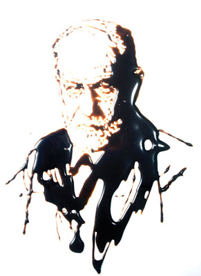 Vik Muniz, Sigmund Freud (From Pictures of Chocolate), Cibachrome, 1997.
 Vik Muniz, Pollock (from Pictures of Chocolate)
During the Muniz lecture, I kept thinking about Richard Prince and the Pandora's box he opened when he presented other people's photographs as his own. Or his joke paintings in which the joke written on the canvas, becomes more pathetic as its content becomes depleted by endless readings. These works had a deep sadness to them, as if there was nothing left to do or say, but only repeat, repeat, repeat what is already known. Muniz also borrows from artists and photographers with abandon, but without any irony or particular feeling. Quoting great art makes his work seem "cultured' and it provides a great composition at no cost. But too often Muniz does not find the chemistry between material and image that transforms the both of them into a new work of art and as a result many of his works are only copies of the art of others made in unusual materials.
Roberto Juarez
I appreciate the thoughtful laying out of Mike’s annoyance with the Muniz lecture. I see the point about originality. But when I think about Muniz I’m thinking about photography and how it is used in ways that are different from painting and design. That’s where Andrea Serrano and his submerged crucifix in urine comes to mind. What we are looking at there is a photograph that triggers a response, which is what Muniz also does in a different way. His renderings of existing art in different media create responses that can be sensual, funny and also tender, all things I look for in art, even photos.
Also Muniz is from Brazil .where survival and joy of life live in the same house, and that sensibility comes through.
There’s a state, when you’re making a painting where you capture a certain liveliness of color and form, yet when you try to take a picture of it, you find it doesn’t translate to photography. You can’t get it. Muniz is able to capture those moments in a way that’s sensual and immediate, that photography doesn’t usually do—not well, anyway.
He has come upon a design-y way to make that media sing and laugh again. Yes, it is gimmicky, but it works. I look at his picture of Freud in chocolate and it’s ridiculous on the one hand, but it sucks me in in a way that goes deeper than just how it’s made. I think his Divas were trashy but that's what I want in a diva. (By the way I think the source for those pictures, were the credits for one of my favorite films as a child in Chicago, "Imitation of Life." )
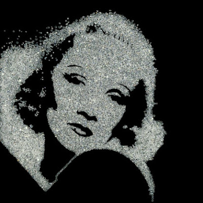 Vik Muniz
I saw one of those diamond diva pictures the day before, at the Phillips de Pury auction house, and it was spectacular. First of all it was big and beautiful and the detail wasn’t tasteful like Andy, but glitzy and tawdry, more like a drag queen. Also Muniz was very strategic about the number of prints he made (three). So in one way he’s saying that photography isn’t precious, but then he makes it precious again, like knocking something off the pedestal and then putting it right back on.
Carol Diehl:
While I appreciate what Roberto is saying, I have to agree with Mike on the point of originality. During the lecture I was totally captivated, but once I left—unlike a great concert where you keep replaying it in your mind with pleasure—the memory of it felt empty. Muniz is delightful and intelligent, his ideas are clever and the pictures are beautiful—but is it our goal to have clever ideas and make pretty pictures? Or is it to present something that provokes a deep emotional response?
What is it we’re always telling our writing students? “Show, don’t tell.” Well it’s true for visual art as well. The best art suggests rather than tells, creates mystery, doesn’t give away the entire story but provides places for our minds to wander in new ways. A truly great work of art bears repeated viewings; every time we look at it we find more to see, experience it differently. When we’re confronted with art-about-art such as Muniz’s, because it’s a treatment of an image we already know, we swallow it whole. There’s no tension because the end of the story was given away in the first paragraph.
I’m an advocate for original imagery not because of any particular art world snobbism or belief in its preciousness, but because the quest for an image that speaks for an artist is supremely difficult and challenging, and that struggle with success and failure ultimately becomes evident in the work, making for a deeper, more satisfying experience for the viewer.
 Vik Muniz, Pictures of Color
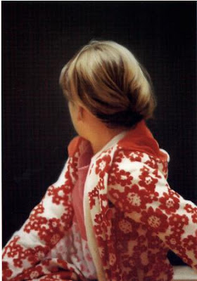 Gerhard Richter: Betty. 1988. Oil on canvas, 101.9 x 59.4 cm. The Saint. Louis Art Museum. Copyright Gerhard Richter. Photo courtesy Saint. Louis Art Museum.
This may seem incongruous coming from an artist who uses found imagery in her own paintings, and who has professed her admiration for Shepard Fairey and Olafur Eliasson: one who takes a certain pride in his lack of technical ability, who samples the work of others to create his images, and the other who works with a team on his ideas. Yet to me this is not at all contradictory—these are simply methods, different avenues taken to arrive at unique statements that engage on a wordless emotional level.
August 15, 2009

The other day, thrilling to the new Silversun Pickups while driving on the Mass Pike to Boston, I found myself wishing that I could get the same feeling from art—the exhilaration, the physical surge in the chest—that happens when I hear great music. Roberto and I were on our way to the Institute of Contemporary Art (ICA) to finally catch Shepard Fairey’s show, “Supply and Demand,” before its closing tomorrow. My attempts to attend the winter opening were foiled by the weather, the following months were filled with travel and constant precipitation, so now—rain or no rain—we were making the two–hour drive.
What did I expect? Well I was a big fan of Shepard Fairey’s graphic work, and I’ve always been captivated by the way graffiti and street art in general can add (as in this photo I recently took in Reykjavik) a layer of poetry to the gritty urban landscape.
What did I expect? Well I was a big fan of Shepard Fairey’s graphic work, and I’ve always been captivated by the way graffiti and street art in general can add (as in this photo I recently took in Reykjavik) a layer of poetry to the gritty urban landscape.
 As consultant, I was enamored enough to suggest Fairey to TIME for the 2007 “Person of the Year” cover of Putin (it ultimately ran on the inside, and he did a new image of Obama for 2008’s cover) and loved his iconic Obama poster, the way it captured the spirit of the man, the campaign and the times, and how simply beautiful it was. I also admired Fairey’s philosophy—in the ridiculous brouhaha over his appropriation of the AP image of Obama (exacerbated by a news media that insists on reproducing the AP photograph not as it originally appeared but as Fairey cropped it) hardly anyone has pointed out that Fairey never intended the image as a money-maker, but made it available for free on his Web site.
However I’d also read Peter Schjeldahl’s New Yorker review, where he described the work in the show as “formulaic,” “slick and resistible,” and Christopher Knight’s review in the LA Times that talked about Fairey’s “limited pictorial vocabulary.”
Therefore I was not prepared for Art with a capital A, or a rush similar to the one I’d just gotten from the Silversun Pickups—or to find that most everyone I talked to afterwards who’d seen the show shared my enthusiasm, including a museum administrator who put it in the top five of museum shows she’s seen…ever.
It was gorgeous.
Photographs cannot reproduce the nuance, depth and complexity of Fairey’s surfaces. Clearly his inspiration comes from the street—the way peeling posters can reveal chance fragments from earlier ones, or how signs painted on the sides of buildings often wear away to expose a jumble of previous messages—yet the result is elegant and sophisticated, as well as soft and sensual. Further, Fairey wrests all this texture and nuance from what every artist knows is the most hard-edged and unforgiving of media: silkscreen.

What I want from art is that perfect marriage of concept and execution, both so fully developed that, as viewers, we are aware of neither, but powerfully in the experience. Yet I hardly ever find it—so much of what is offered seems half-realized, as if the artist is afraid to take a stand, afraid to actually make something, afraid to commit him/her self fully to an image, an object. Execution is either overdone relative to the flimsiness of the idea, or too casually rendered, as if the idea in itself should be enough. I want to see work that holds up from afar but gives me something to look at up close. I want to see art that looks as if the artist cares.
 Packed with complexity and contradiction as well as humor, Fairey’s work does all these things. We stay with his messages about money, power and war because they are embedded in a richness of visual detail, the sumptuous mélange of influences (Russian Constructivism, Middle Eastern art, Pop Art, official engravings such as paper money and stamps, advertising, to name a few) that adds up to his very singular style.
 It felt like a feast.
Afterwards we gave the permanent collection a run-through, but following Fairey everything seemed tepid and flat. Then, after a delicious lunch on the windy outdoor terrace overlooking the Charles, we went through the exhibition again. I attempted to get a press kit, images for this blog and to present for reviews, and to find out if the show is traveling, but was told that the administrative, curatorial and press staff were all on vacation that Thursday afternoon and photographs, even by press, were prohibited. (Photography prohibited? In a Shepard Fairey exhibition? )
We’d intended to augment our Boston visit with a stop at the Isabella Steward Gardner Museum and some fabulous seafood dinner, but decided instead to just get back in the car and drive home.
We were full.
Silverson Pickups' "Panic Switch"
February 6, 2009
 Christmas lights, Great Barrington, MA, December 2008
"What the cynics fail to understand, is that the ground has shifted beneath them."--President Obama's inaugural address.
I started writing this a month ago, but was so bored I didn't finish, because it's just too boring to write about being bored. But truly, since returning from Berlin in November, I've not been able to get interested in art, which is a problem considering that it's not only my field, but too late in life to take up another profession--such as plumbing or neurobiology, or become a concert pianist after all. However either out of habit or false hope, I've continued to trudge around to museums and galleries looking for inspiration, not just to write about, but for my studio practice, which is in need of a reboot.
What first set me on the road to ennui was Eleanor Antin, The King, 1972 (image from the Web)
 Eleanor Antin, The Angel of Mercy (Florence Nightingale), Myself-1854, 1977 (Image from the Web)
After that it was the Institute of Contemporary Art (ICA) in Boston, a museum I want desperately to like, whose new building (and admission fee—$12 per person plus $11 or more for parking) sets off all kinds of expectations that, so far, have not been met by what’s inside. This time the main show was Tara Donovan, who makes installations with mass-produced disposable objects, such as plastic cups and toothpicks. I can see how the idea might be interesting (“Ooh, Honey, did you realize this is made of plastic straws?”) to someone who hasn’t taught a gazillion graduate students. In my experience, at least one third of the graduate population has latched onto similar ideas as a way of getting out of actually making something without having to spend much money or travel farther than the nearest convenience store (I wish I had a dollar for every piece of art I’ve seen made of black plastic garbage bags). Then there’s the text that suggests that because Donovan has figured out a way to make a cube out of metal sewing pins, she’s part of a lineage that includes Donald Judd—with whom she has about as much in common as Santa Claus.
Which brings me to one of my favorite subjects: wall text (some of my readers may already be aware of my promise to abolish it, along with artist statements, when I’m king). I’m clueless as to why such a small museum would give over any space to a permanent collection, but if they do, they’d better make sure it stands up to multiple viewings. This one threatens to become a Saatchi-esque time capsule, with texts that read like exercises one might be required to write in curator school. This, for instance, next to a painting that appears equally academically-driven:
Untitled continues Lucy McKenzie's exploration of latent meanings in design styles, expanding a detail from an advertising image she found on a condom vending machine of two robots amorously engaged. The scene is rendered in a Mondrian-esque style using geometric blocks and is rendered in faux marble to make the "ugly" scene appear more elegant. The work also includes two figures in shadow, as if in conversation while looking at the painting.
And back in New York, at the New Museum, while Elizabeth Peyton's paintings were charming, did they justify this curator's paean?
Where her earliest portraits can be compared to those of Dutch masters or Spanish painters in their quietude and focus on the aspect of a single subject in the center of the picture plane, beginning in the 2000s, Peyton's maturity as a painter is expressed in the increasing complexity of her compositions. In the history of portraiture, these later works can be more closely compared to figure compositions by Henri Matisse or Eduard Vuillard, both of whom integrated their human subjects with their static ones in dense surfaces of pattern and brilliant color.
But what finished me off was the Marlene Dumas painting exhibition at MoMA (through February 16th). As Peter Schjeldahl wrote in The New Yorker:
She has been favored by a fashion for sensationalized moral seriousness which explains the recent prestige of Francis Bacon and Lucian Freud and of younger masters of sardonic melancholy, including Luc Tuymans of Antwerp, and Neo Rauch of Leipzig. Is this taste a self-flagellating compunction of the spendthrift rich? Surely no one would paint pictures as aggressively uningratiating as those of Dumas unless she meant them.
Well, I don't care whether she means it or not, the "artist's intention" holds little interest for me, only the result--which here, despite Schjeldahl's rhapsody over Dumas's brushwork, is heavy-handed and depressing. I’m not opposed to so-called “serious” subject matter, but a little nuance would be nice. Interestingly, in that same New Yorker, David Denby reviews the film “Revolutionary Road,” and while finding it “honorably and brutally unnerving,” suggests that it “may suffer…from the illusion that pain and art are the same thing.” He could have been writing about Dumas.
After that I was sure I never wanted to see any more art ever again.
Later I began to think that my reaction had to do with the sense that the art I was seeing was looking old, because--in case you haven’t noticed--we’re in the midst of a great cultural shift. And unlike generations in the past who experienced the massive change that came with the invention of the printing press or the rise of the Industrial Revolution, we know it, can feel and see it. It’s fast, so fast that when I was working with the art director on TIME’s Person of the Year, he noted that if we had commissioned a portrait of Obama in October, it wouldn’t be the one we’d want to run in December. And the Tom Friedman piece of December 23rd that I wanted to link to when I started writing this, Time to Re-Boot America now feels as if it was penned a year ago rather than just a month or so.
It’s a time of purging, of getting rid of what doesn’t work and replacing it with…well we don’t know. But it’s inevitable that art will change with it, old systems will be replaced with new ones, and that which doesn’t deliver, will fail.
And while I don't have a crystal ball, I'll make some predictions just because this is my blog and I can. I believe that in the future (which, the way things are going, could be next week) we’re going to be less fascinated with human dysfunction (a la Dumas and Sherman) and seek more art that inspires us, has substance, puts us in awe of human capability. I hope that we’ll also figure out another way of experiencing art that doesn’t involve rectangular rooms, white walls, and track lighting. I want art to engage and involve, be more than this static thing that we look at while standing on our feet (although I dislike so-called “interactive art" even more), but has to do with its context and, like music, is woven into the fabric of our lives. I believe the era of the individual genius is waning, and instead collaborative ventures (between individuals as well as disciplines) will come to the forefront. That means chucking the our current system of teaching visual art, which has hardly changed for centuries (okay, so we teach “media arts” now, it’s still a separate department) and move toward one that’s integrated with science, mathematics, agriculture, history, and technology, as well as the other arts.
I also believe people will always be fascinated with painting.
With these thoughts in mind, I went to Chelsea yet again, and this time saw two exhibitions that looked not only far from tired, but fresh and new. The irony is that one was done by an 80-year-old, Robert Irwin, and the other by Fred Sandback who, were he still alive, would be in his mid-sixties. Both installations are serene, sure, engaging and beautiful. Oh, did I mention beauty? Well I believe in beauty, and think it’s a human need, as important as fresh air and water. It's definitely due for a comeback.
 Installation view of Robert Irwin's Red Drawing White Drawing Black Painting, on view at PaceWildenstein, 545 West 22nd Street, NYC through February 28, 2009. Photo by G.R. Christmas/Courtesy Pace Wildenstein, New York.
These images , however, hardly convey the experience of being there, which is why Irwin, in the early days, refused to have his work photographed.
And Shepard Fairey is, for sure, of his/our time. Creator of the now iconic image of Obama that became so important to the campaign—as symbolic of our decade as Robert Indiana's Love was to the 60’s—the attention given him now is well-deserved. I knew about Fairey’s work through my son, Matt, and last year suggested to TIME that they commission him to do a portrait of the 2007 Person of the Year, Vladimir Putin, which ran on the inside of the magazine:
 Vladimir Putin by Shepard Fairey for TIME, 2007
This year TIME invited Fairey to do another image of Obama (see video) for the cover, and it's every bit as strong as the first--and updated, more "now" than last year's poster. What I especially like about Fairey’s new fame--in this time of fallout from extreme greed--is that it stems from an image he gave away (which is why I think the current copyright flap won't hold water--as a picture-researcher friend, put it: "Since the poster/image took on a life of it's own, was 'used' by so many people without even Fairey's permission... how could one begin to determine a use fee?").
 Barack Obama by Shepard Fairey for TIME, 2008
And now the ICA in Boston (so critized above) is on its way to redeeming itself in my eyes by being smart enough to mount the first museum survey of Fairey's work, which opens tomorrow and runs through August 16th.


